

Menu

How might we design a social experience that prioritizes real-world meetings over endless digital conversations?
This project is a social networking / dating app focused on real-life connections, not endless texting.The goal was simple: help people move from matching to meeting faster by removing the friction, fatigue, and ambiguity that usually come with long chat threads.
Instead of encouraging days (or weeks) of conversations that often go nowhere, the product is designed to nudge users toward intentional, in-person dates.
Context
Dating app
2025 April - August
Role
Product Designer
Platform
Mobile
(01)
The Problem
Most dating and social networking apps optimize for engagement, not outcomes.
Users match.They chat.The chat drags.Momentum dies.No date happens.
(02)
Challenge
Designing for “less chatting” introduced a unique challenge:
Chat is the safety net for most dating apps
Removing or limiting it can feel risky or uncomfortable
Users still need to feel safe, respected, and in control
The experience must feel intentional, not rushed or awkward
(03)
Approach & Design Framework
The Human-Centered Systems framework looks at three core layers:
- Human behavior: How people naturally act, hesitate, and procrastinate
- System design: How the product nudges, restricts, or enables behavior
- Incentives & feedback loops: What the system rewards or discourages
Rather than asking “What do users want?”, the framework asks:“What behavior does the system currently produce, and how can we redesign it?”
(04)
Research and Insights
Research focused on understanding behavior patterns, not just preferences.
Key Insights
- Long chats create a false sense of progress
- The absence of structure increases procrastination
- People delay meeting because there’s no social cost to waiting
- Clear next steps reduce anxiety around dating
- Systems shape behavior more than intentions
(05)
Design Solution
The design reshaped the system to reward action over hesitation.
Key Design Outcomes:
- Structured interaction flow that naturally leads toward a date
- Intent signaling early (availability, comfort level, purpose)
- Behavioral nudges that suggest meeting when mutual interest is detected
- Reduced chat dependency by limiting open-ended conversations
- Clear exits and controls to maintain safety and autonomy
Instead of forcing users to go on dates, the system makes meeting the easiest next step.
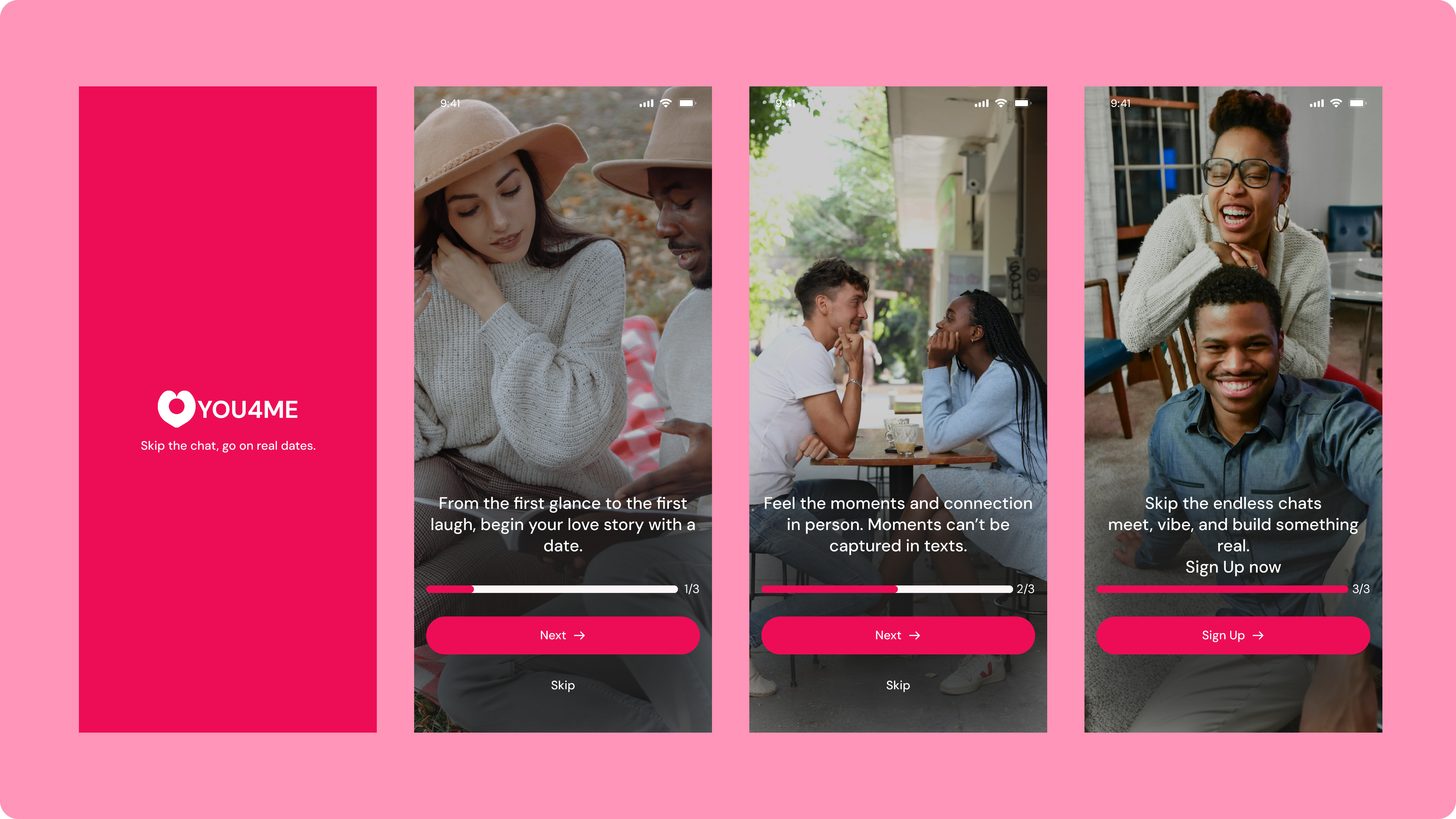
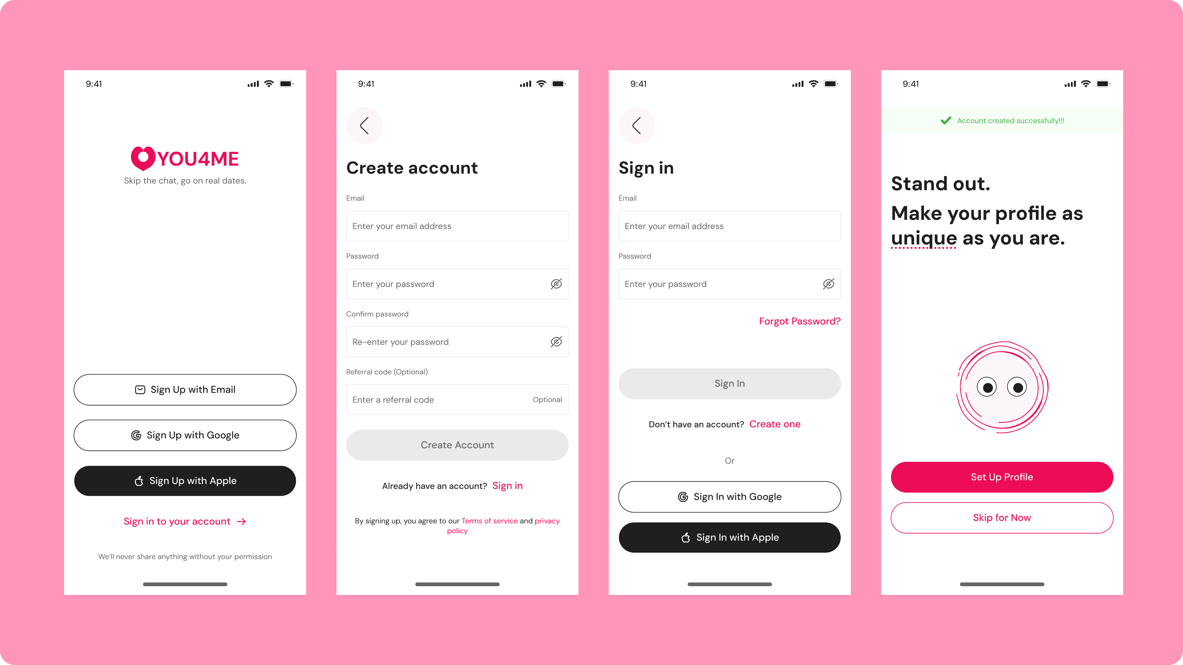
Onboarding Screens
These onboarding screens emphasizes authentic, in-person connections over endless digital messaging.
These onboarding screens emphasizes authentic, in-person connections over endless digital messaging. The onboarding screens position itself as the anti-endless-messaging platform for people who want to skip the small talk and experience authentic romantic connections in person. It guides users to know what the app is all about.
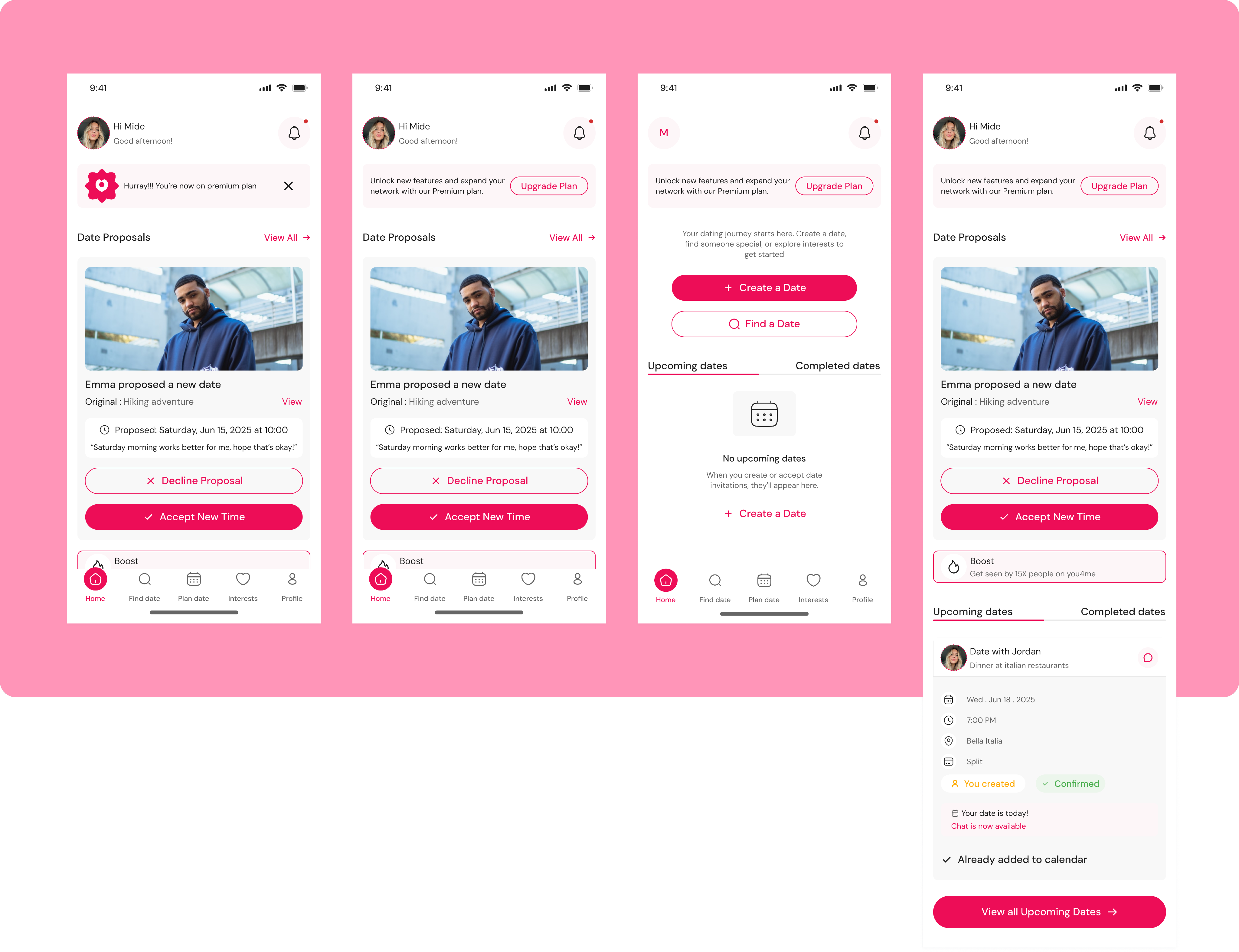
Home
The interface allows users to view incoming proposals, accept them with a new time if the original doesn't work, or decline politely, all within a few taps.
These home screens showcase the app's core feature: a date proposal system that solves the awkward "when should we meet?" problem in online dating. Instead of endless back-and-forth messaging trying to coordinate schedules, users can send and receive concrete date proposals with specific times, locations, and activities already planned. The interface allows users to view incoming proposals, accept them with a new time if the original doesn't work, or decline politely, all within a few taps.
Find Date
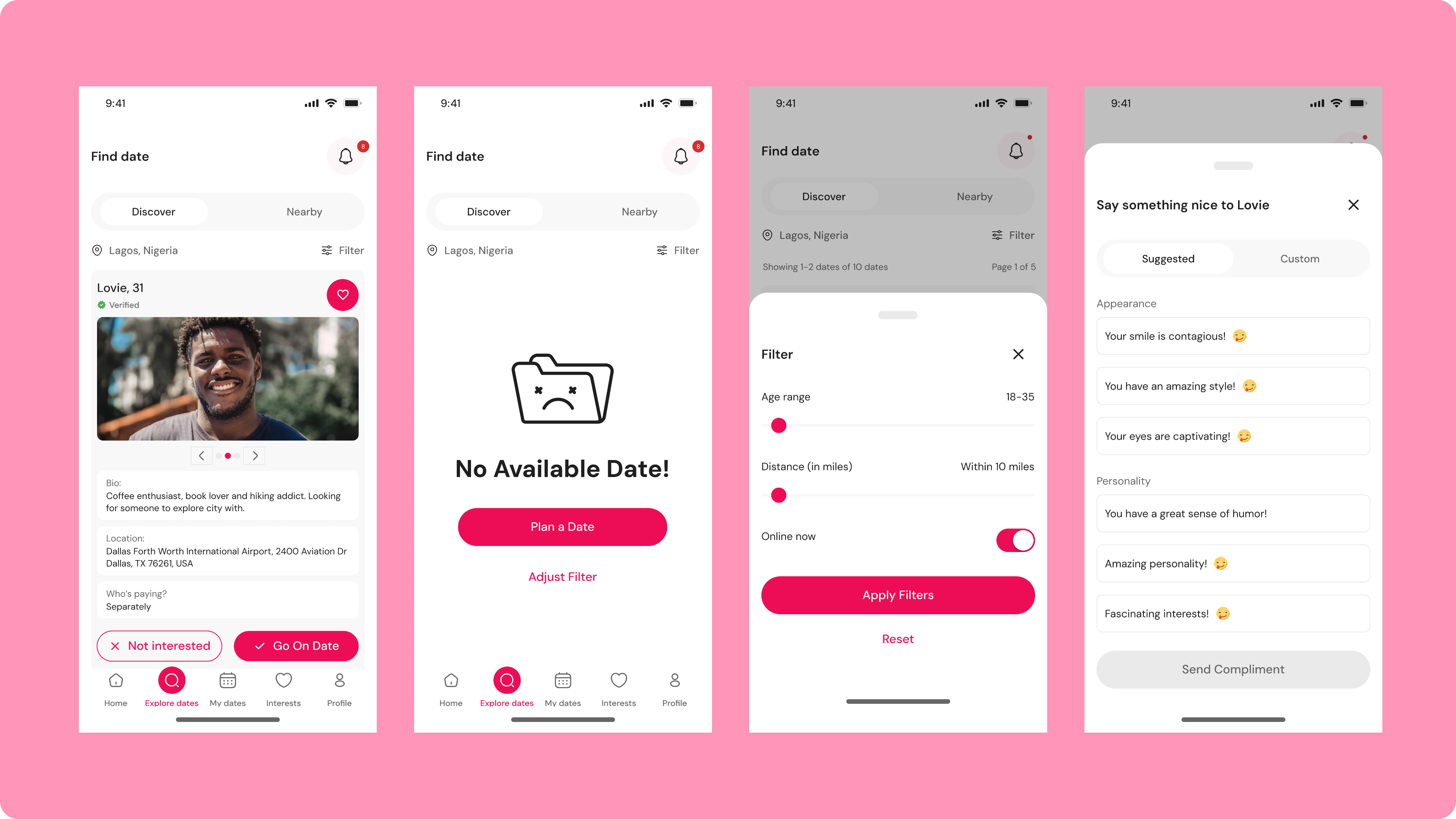
Find date feature address the challenge of discovering compatible potential matches who are actually available and ready to meet in person.
The feature allows users to browse profiles of people actively seeking dates in their area, with filters for age range, distance, and online availability to ensure they're finding realistic options. When no matches are available based on current filters, the app offers clear next steps, either plan a date yourself or adjust your search criteria, preventing the frustration of empty search results. The interface also includes a thoughtful compliment feature with suggested conversation starters, solving the problem of awkward first messages or not knowing how to break the ice.
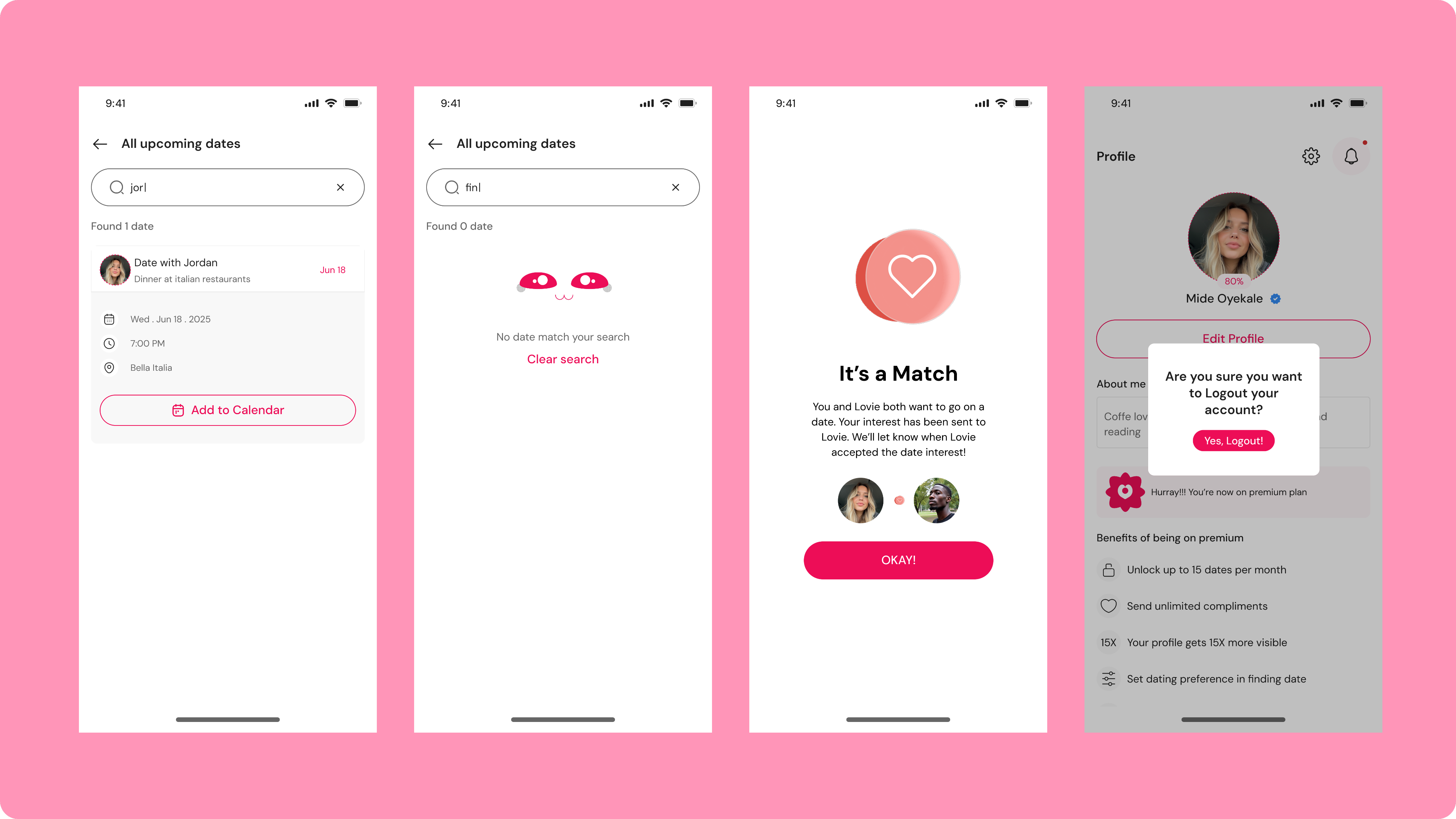
My dates
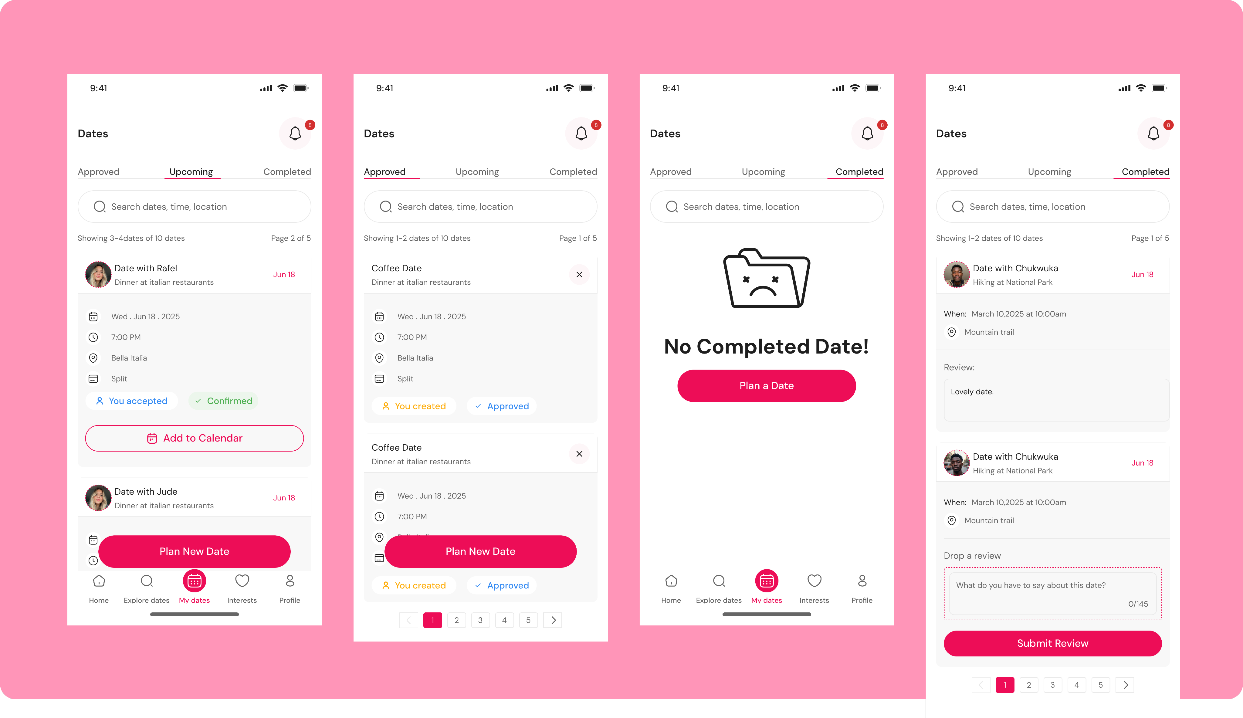
My dates screens solve the organizational chaos that comes with managing multiple dating prospects and actual meetups by providing a centralized dashboard for all date-related activity.
The interface categorizes dates into three clear tabs, Approved, Upcoming, and Completed, so users always know the status of each date without digging through message threads or trying to remember who they're supposed to meet when. Each date card displays essential details at a glance (who, when, where, and how costs are split), with clear status indicators showing whether the user created or accepted the date and whether it's been confirmed. The "Add to Calendar" feature eliminates the risk of double-booking or forgetting about a date, while the review system on completed dates helps users reflect on their experiences and potentially provides valuable feedback for future matching.
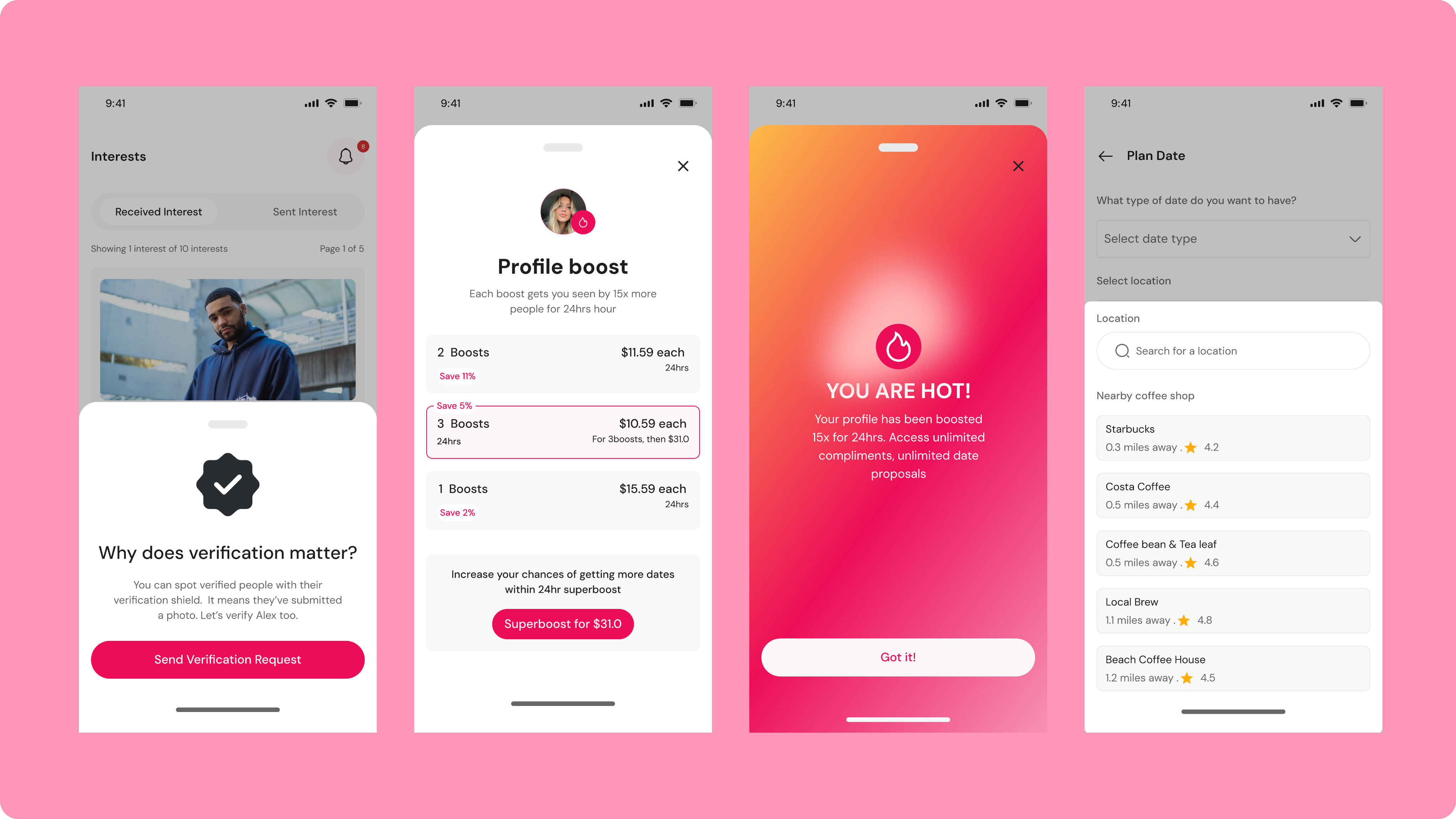
Interests
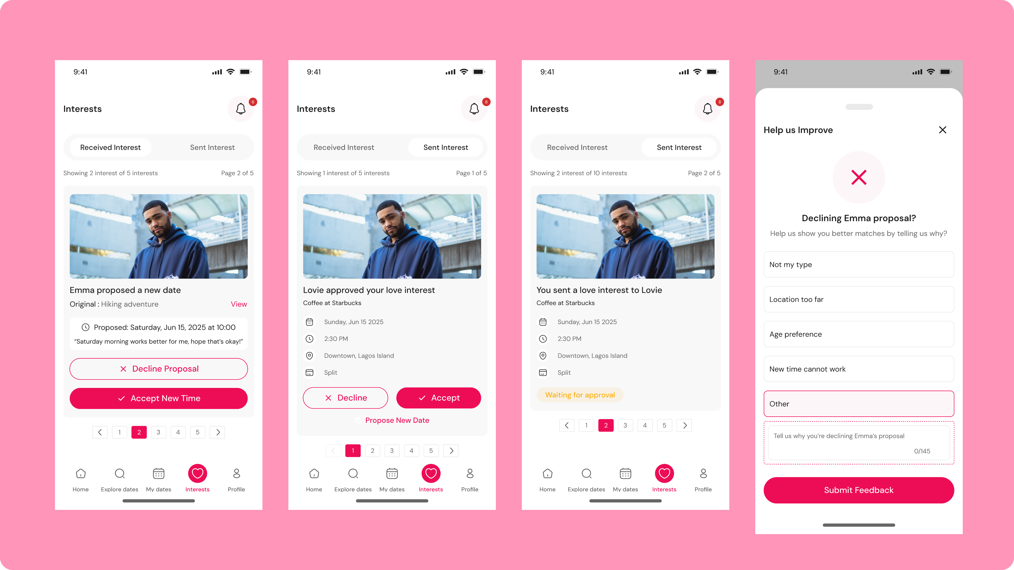
Interests screens tackle the frustration of expressing romantic interest without the pressure or ambiguity of traditional dating app interactions.
The feature creates a clear, organized system where users can see who's interested in dating them (Received Interest) and track the date proposals they've sent to others (Sent Interest), eliminating the confusion of wondering whether someone actually wants to meet or is just browsing profiles. By allowing users to approve, decline, or propose alternative dates with specific details already included, the interface removes the awkward dance of trying to gauge interest levels through vague messages. The feedback mechanism that appears when declining ("Help us improve") addresses a crucial matching problem by letting users explain why someone isn't a good fit, whether it's location, timing, age preference, or simply not their type, which helps the algorithm learn and show better matches over time.
This system solves the twin problems of unclear intentions and poor matching quality, ensuring that everyone involved knows exactly where they stand and that the app gets smarter about connecting compatible people who are genuinely interested in meeting each other.
Profile
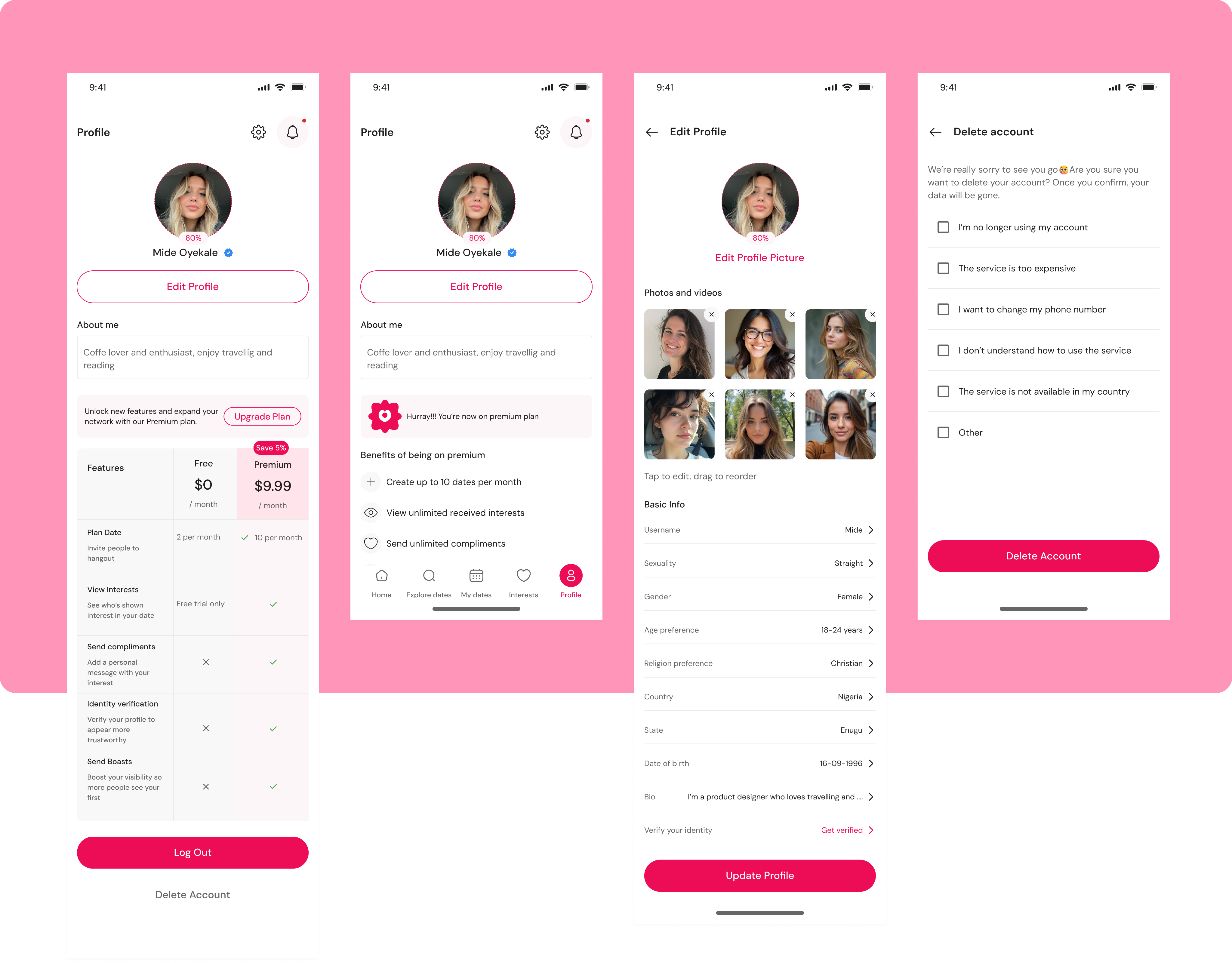
Addresses the transparency and control issues that plague many dating apps by giving users complete ownership over their presence and subscription.
The profile section clearly displays verification status, personal information, and a detailed breakdown of free versus premium features, solving the common frustration of hidden paywalls and unclear upgrade benefits. Users can see exactly what they get at each tier, how many dates they can plan, whether they can view interests, and if they can send compliments, eliminating surprise limitations mid-use. The edit profile functionality allows comprehensive customization of photos, bio, and preferences (from basic demographics to religion and location), ensuring users can present themselves authentically and set accurate matching criteria. The thoughtful account deletion flow even asks why users are leaving, providing valuable feedback categories like cost concerns, usability issues, or geographic availability
Results and Impacts
After launching the redesigned experience to a pilot group, we measured success based on real-world outcomes, not just in-app engagement.
- +42% increase in scheduled dates
- +28% improvement in match-to-meet rate
- –35% reduction in chat length before meeting
- –22% fewer stalled conversations
- +31% increase in user satisfaction
Lesson
- Friction is the enemy of real connections – Removing unnecessary chat barriers accelerates real-world interactions.
- Structure builds confidence – Users are more likely to meet when the app provides clear next steps and guidance.
- Trust and safety can’t be sacrificed – Reducing chat shouldn’t mean users feel unsafe or pressured.
- Behavioral nudges work – Gentle suggestions toward scheduling a date are more effective than forcing action.
- Outcome-focused metrics matter – Success should be measured by actual meetups, not matches or messages sent.
- Users appreciate clarity over endless choice – Simplifying options reduces decision fatigue and increases follow-through.
Next Project
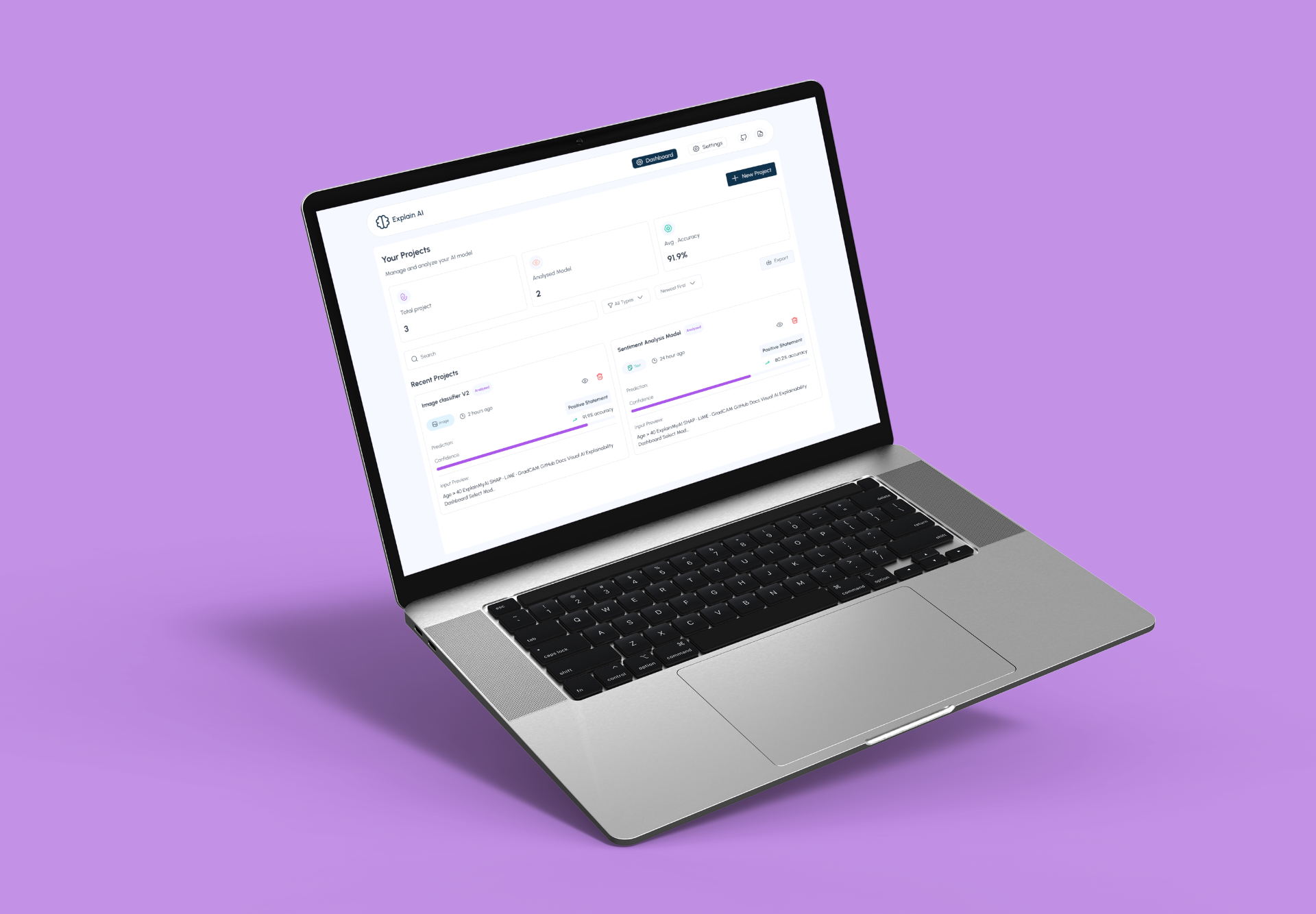
Explain AI


How might we design a social experience that prioritizes real-world meetings over endless digital conversations?
This project is a social networking / dating app focused on real-life connections, not endless texting.The goal was simple: help people move from matching to meeting faster by removing the friction, fatigue, and ambiguity that usually come with long chat threads.
Instead of encouraging days (or weeks) of conversations that often go nowhere, the product is designed to nudge users toward intentional, in-person dates.
Context
Dating app
2025 April - August
Role
Product Designer
Platform
Mobile
(01)
The Problem
Most dating and social networking apps optimize for engagement, not outcomes.
Users match.They chat.The chat drags.Momentum dies.No date happens.
From a design perspective, this creates:
- Emotional fatigue from repetitive conversations
- Decision paralysis (“What should I say next?”)
- A false sense of connection that never translates offline
(02)
Challenge
Designing for “less chatting” introduced a unique challenge:
Chat is the safety net for most dating apps
Removing or limiting it can feel risky or uncomfortable
Users still need to feel safe, respected, and in control
The experience must feel intentional, not rushed or awkward
(03)
Approach & Design Framework
The Human-Centered Systems framework looks at three core layers:
- Human behavior: How people naturally act, hesitate, and procrastinate
- System design: How the product nudges, restricts, or enables behavior
- Incentives & feedback loops: What the system rewards or discourages
Rather than asking “What do users want?”, the framework asks:“What behavior does the system currently produce, and how can we redesign it?”
(04)
Research and Insights
Research focused on understanding behavior patterns, not just preferences.
Key Insights
- Long chats create a false sense of progress
- The absence of structure increases procrastination
- People delay meeting because there’s no social cost to waiting
- Clear next steps reduce anxiety around dating
- Systems shape behavior more than intentions
(05)
Design Solution
The design reshaped the system to reward action over hesitation.
Key Design Outcomes:
- Structured interaction flow that naturally leads toward a date
- Intent signaling early (availability, comfort level, purpose)
- Behavioral nudges that suggest meeting when mutual interest is detected
- Reduced chat dependency by limiting open-ended conversations
- Clear exits and controls to maintain safety and autonomy
Instead of forcing users to go on dates, the system makes meeting the easiest next step.
Onboarding Screens
These onboarding screens emphasizes authentic, in-person connections over endless digital messaging.
These onboarding screens emphasizes authentic, in-person connections over endless digital messaging. The onboarding screens position itself as the anti-endless-messaging platform for people who want to skip the small talk and experience authentic romantic connections in person. It guides users to know what the app is all about.
Home
The interface allows users to view incoming proposals, accept them with a new time if the original doesn't work, or decline politely, all within a few taps.
These home screens showcase the app's core feature: a date proposal system that solves the awkward "when should we meet?" problem in online dating. Instead of endless back-and-forth messaging trying to coordinate schedules, users can send and receive concrete date proposals with specific times, locations, and activities already planned. The interface allows users to view incoming proposals, accept them with a new time if the original doesn't work, or decline politely, all within a few taps.
Find Date
Find date feature address the challenge of discovering compatible potential matches who are actually available and ready to meet in person.
The feature allows users to browse profiles of people actively seeking dates in their area, with filters for age range, distance, and online availability to ensure they're finding realistic options. When no matches are available based on current filters, the app offers clear next steps, either plan a date yourself or adjust your search criteria, preventing the frustration of empty search results. The interface also includes a thoughtful compliment feature with suggested conversation starters, solving the problem of awkward first messages or not knowing how to break the ice.
My dates
My dates screens solve the organizational chaos that comes with managing multiple dating prospects and actual meetups by providing a centralized dashboard for all date-related activity.
The interface categorizes dates into three clear tabs, Approved, Upcoming, and Completed, so users always know the status of each date without digging through message threads or trying to remember who they're supposed to meet when. Each date card displays essential details at a glance (who, when, where, and how costs are split), with clear status indicators showing whether the user created or accepted the date and whether it's been confirmed. The "Add to Calendar" feature eliminates the risk of double-booking or forgetting about a date, while the review system on completed dates helps users reflect on their experiences and potentially provides valuable feedback for future matching.
Interests
Interests screens tackle the frustration of expressing romantic interest without the pressure or ambiguity of traditional dating app interactions.
The feature creates a clear, organized system where users can see who's interested in dating them (Received Interest) and track the date proposals they've sent to others (Sent Interest), eliminating the confusion of wondering whether someone actually wants to meet or is just browsing profiles. By allowing users to approve, decline, or propose alternative dates with specific details already included, the interface removes the awkward dance of trying to gauge interest levels through vague messages. The feedback mechanism that appears when declining ("Help us improve") addresses a crucial matching problem by letting users explain why someone isn't a good fit, whether it's location, timing, age preference, or simply not their type, which helps the algorithm learn and show better matches over time.
This system solves the twin problems of unclear intentions and poor matching quality, ensuring that everyone involved knows exactly where they stand and that the app gets smarter about connecting compatible people who are genuinely interested in meeting each other.
Profile
Addresses the transparency and control issues that plague many dating apps by giving users complete ownership over their presence and subscription.
The profile section clearly displays verification status, personal information, and a detailed breakdown of free versus premium features, solving the common frustration of hidden paywalls and unclear upgrade benefits. Users can see exactly what they get at each tier, how many dates they can plan, whether they can view interests, and if they can send compliments, eliminating surprise limitations mid-use. The edit profile functionality allows comprehensive customization of photos, bio, and preferences (from basic demographics to religion and location), ensuring users can present themselves authentically and set accurate matching criteria. The thoughtful account deletion flow even asks why users are leaving, providing valuable feedback categories like cost concerns, usability issues, or geographic availability
Results and Impacts
After launching the redesigned experience to a pilot group, we measured success based on real-world outcomes, not just in-app engagement.
- +42% increase in scheduled dates
- +28% improvement in match-to-meet rate
- –35% reduction in chat length before meeting
- –22% fewer stalled conversations
- +31% increase in user satisfaction
Lesson
- Friction is the enemy of real connections – Removing unnecessary chat barriers accelerates real-world interactions.
- Structure builds confidence – Users are more likely to meet when the app provides clear next steps and guidance.
- Trust and safety can’t be sacrificed – Reducing chat shouldn’t mean users feel unsafe or pressured.
- Behavioral nudges work – Gentle suggestions toward scheduling a date are more effective than forcing action.
- Outcome-focused metrics matter – Success should be measured by actual meetups, not matches or messages sent.
- Users appreciate clarity over endless choice – Simplifying options reduces decision fatigue and increases follow-through.
Next Project
Explain AI


How might we design a social experience that prioritizes real-world meetings over endless digital conversations?
This project is a social networking / dating app focused on real-life connections, not endless texting.The goal was simple: help people move from matching to meeting faster by removing the friction, fatigue, and ambiguity that usually come with long chat threads.
Instead of encouraging days (or weeks) of conversations that often go nowhere, the product is designed to nudge users toward intentional, in-person dates.
Context
Dating app
2025 April - August
Role
Product Designer
Platform
Mobile
(01)
The Problem
Most dating and social networking apps optimize for engagement, not outcomes.
Users match.They chat.The chat drags.Momentum dies.No date happens.
From a design perspective, this creates::
- Emotional fatigue from repetitive conversations
- Decision paralysis (“What should I say next?”)
- A false sense of connection that never translates offline
- Emotional fatigue from repetitive conversations
- Decision paralysis (“What should I say next?”)
- A false sense of connection that never translates offline
(02)
Challenge
Designing for “less chatting” introduced a unique challenge:
Chat is the safety net for most dating apps
Removing or limiting it can feel risky or uncomfortable
Users still need to feel safe, respected, and in control
The experience must feel intentional, not rushed or awkward
(03)
Approach & Design Framework
The Human-Centered Systems framework looks at three core layers:
- Human behavior: How people naturally act, hesitate, and procrastinate
- System design: How the product nudges, restricts, or enables behavior
- Incentives & feedback loops: What the system rewards or discourages
Rather than asking “What do users want?”, the framework asks:“What behavior does the system currently produce, and how can we redesign it?”
(04)
Research and Insights
Research focused on understanding behavior patterns, not just preferences.
Key Insights
- Long chats create a false sense of progress
- The absence of structure increases procrastination
- People delay meeting because there’s no social cost to waiting
- Clear next steps reduce anxiety around dating
- Systems shape behavior more than intentions
(05)
Design Solution
The design reshaped the system to reward action over hesitation.
Key Design Outcomes:
- Structured interaction flow that naturally leads toward a date
- Intent signaling early (availability, comfort level, purpose)
- Behavioral nudges that suggest meeting when mutual interest is detected
- Reduced chat dependency by limiting open-ended conversations
- Clear exits and controls to maintain safety and autonomy
Instead of forcing users to go on dates, the system makes meeting the easiest next step.
Onboarding Screens
These onboarding screens emphasizes authentic, in-person connections over endless digital messaging.
These onboarding screens emphasizes authentic, in-person connections over endless digital messaging. The onboarding screens position itself as the anti-endless-messaging platform for people who want to skip the small talk and experience authentic romantic connections in person. It guides users to know what the app is all about.
Home
The interface allows users to view incoming proposals, accept them with a new time if the original doesn't work, or decline politely, all within a few taps.
These home screens showcase the app's core feature: a date proposal system that solves the awkward "when should we meet?" problem in online dating. Instead of endless back-and-forth messaging trying to coordinate schedules, users can send and receive concrete date proposals with specific times, locations, and activities already planned. The interface allows users to view incoming proposals, accept them with a new time if the original doesn't work, or decline politely, all within a few taps.
Find Date
Find date feature address the challenge of discovering compatible potential matches who are actually available and ready to meet in person.
The feature allows users to browse profiles of people actively seeking dates in their area, with filters for age range, distance, and online availability to ensure they're finding realistic options. When no matches are available based on current filters, the app offers clear next steps, either plan a date yourself or adjust your search criteria, preventing the frustration of empty search results. The interface also includes a thoughtful compliment feature with suggested conversation starters, solving the problem of awkward first messages or not knowing how to break the ice.
My dates
My dates screens solve the organizational chaos that comes with managing multiple dating prospects and actual meetups by providing a centralized dashboard for all date-related activity.
The interface categorizes dates into three clear tabs, Approved, Upcoming, and Completed, so users always know the status of each date without digging through message threads or trying to remember who they're supposed to meet when. Each date card displays essential details at a glance (who, when, where, and how costs are split), with clear status indicators showing whether the user created or accepted the date and whether it's been confirmed. The "Add to Calendar" feature eliminates the risk of double-booking or forgetting about a date, while the review system on completed dates helps users reflect on their experiences and potentially provides valuable feedback for future matching.
Interests
Interests screens tackle the frustration of expressing romantic interest without the pressure or ambiguity of traditional dating app interactions.
The feature creates a clear, organized system where users can see who's interested in dating them (Received Interest) and track the date proposals they've sent to others (Sent Interest), eliminating the confusion of wondering whether someone actually wants to meet or is just browsing profiles. By allowing users to approve, decline, or propose alternative dates with specific details already included, the interface removes the awkward dance of trying to gauge interest levels through vague messages. The feedback mechanism that appears when declining ("Help us improve") addresses a crucial matching problem by letting users explain why someone isn't a good fit, whether it's location, timing, age preference, or simply not their type, which helps the algorithm learn and show better matches over time.
This system solves the twin problems of unclear intentions and poor matching quality, ensuring that everyone involved knows exactly where they stand and that the app gets smarter about connecting compatible people who are genuinely interested in meeting each other.
Profile
Addresses the transparency and control issues that plague many dating apps by giving users complete ownership over their presence and subscription.
The profile section clearly displays verification status, personal information, and a detailed breakdown of free versus premium features, solving the common frustration of hidden paywalls and unclear upgrade benefits. Users can see exactly what they get at each tier, how many dates they can plan, whether they can view interests, and if they can send compliments, eliminating surprise limitations mid-use. The edit profile functionality allows comprehensive customization of photos, bio, and preferences (from basic demographics to religion and location), ensuring users can present themselves authentically and set accurate matching criteria. The thoughtful account deletion flow even asks why users are leaving, providing valuable feedback categories like cost concerns, usability issues, or geographic availability
Results and Impacts
After launching the redesigned experience to a pilot group, we measured success based on real-world outcomes, not just in-app engagement.
- +42% increase in scheduled dates
- +28% improvement in match-to-meet rate
- –35% reduction in chat length before meeting
- –22% fewer stalled conversations
- +31% increase in user satisfaction
Lesson
- Friction is the enemy of real connections – Removing unnecessary chat barriers accelerates real-world interactions.
- Structure builds confidence – Users are more likely to meet when the app provides clear next steps and guidance.
- Trust and safety can’t be sacrificed – Reducing chat shouldn’t mean users feel unsafe or pressured.
- Behavioral nudges work – Gentle suggestions toward scheduling a date are more effective than forcing action.
- Outcome-focused metrics matter – Success should be measured by actual meetups, not matches or messages sent.
- Users appreciate clarity over endless choice – Simplifying options reduces decision fatigue and increases follow-through.
Next Project
Explain AI
