

Menu
How might we turn analytics from a source of overwhelm into a tool for confident decision-making?
Most creators and growing businesses don’t lack data, they lack clarity. Metrics live across multiple tools, dashboards are crowded with numbers, and insights are often buried beneath charts that demand more attention than users can afford. This project began with a simple question:
Context
AI product Web app
2025 sep - oct
Role
Product Designer
Platform
Desktop
(01)
Challenge
Creators and growing businesses depend heavily on data to guide content, marketing, and revenue decisions. However, most analytics tools are either:
- Too fragmented across multiple platforms
- Overloaded with metrics that lack clear context
- Difficult to use on smaller screens despite users frequently checking data on mobile
The core challenge was to design an analytics experience that turns complex, multi-source data into clear insights, without overwhelming users, while remaining fully usable across devices.
(02)
Approach & Design Framework
I approached this project with a decision-first design mindset, focusing on how users interpret data and take action rather than how much information is displayed. The work began with clear problem framing, recognising that users don’t need more metrics, but clearer signals that highlight what matters most. I prioritised user questions such as what’s happening now, how performance is changing over time, and where attention is needed next, using these to shape information hierarchy and layout. To reduce cognitive load without sacrificing depth, I applied progressive disclosure, surfacing high-level insights first and revealing detailed data only when users chose to explore further. Responsiveness was considered from the start, treating each breakpoint as a distinct experience to ensure key insights remained accessible during quick, on-the-go check-ins. Every design decision was evaluated through a single lens: whether it helped users move from data to confident action.
(03)
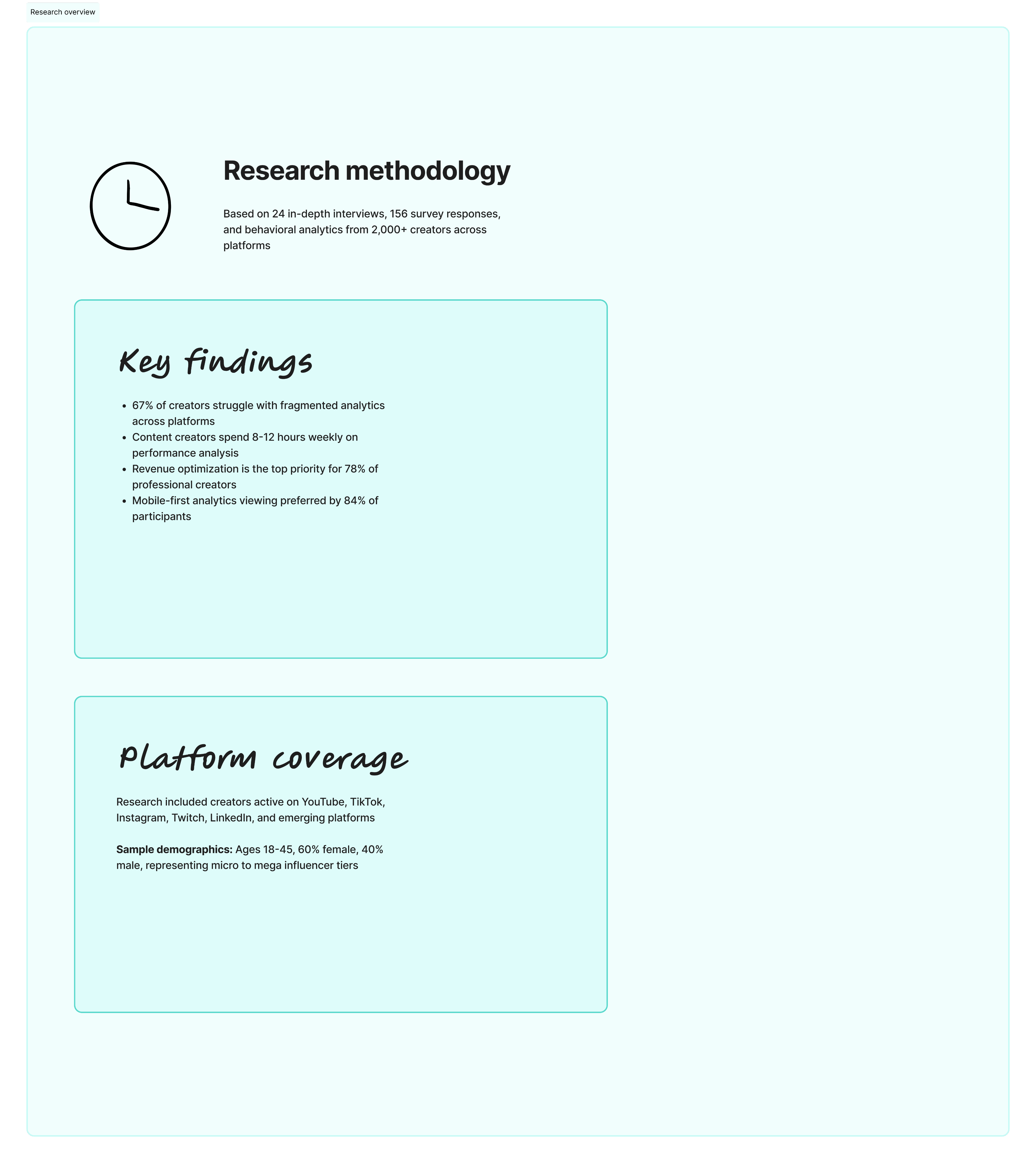
Research and Insights
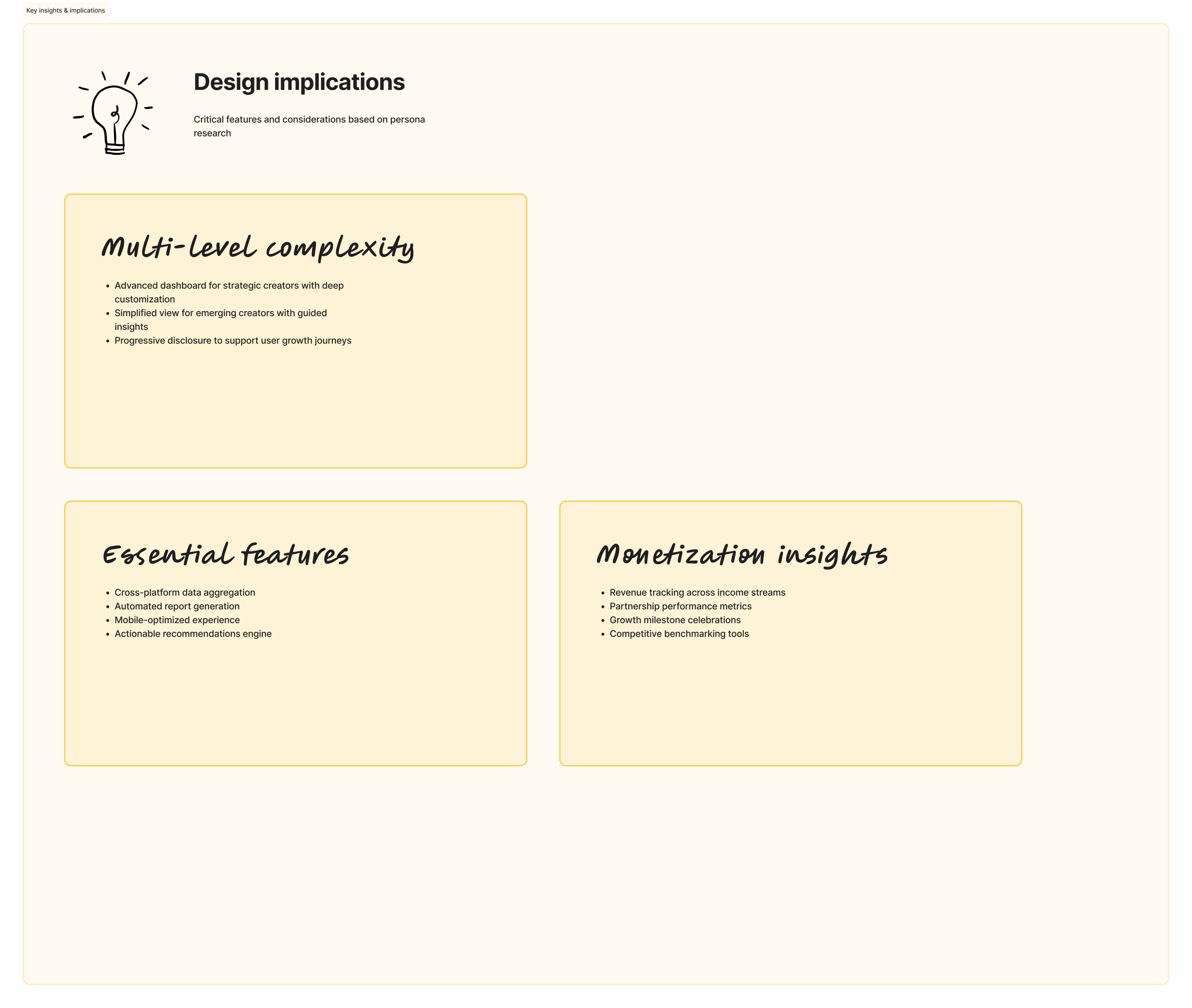
I conducted lightweight qualitative research by reviewing existing analytics tools, analysing common user complaints, and synthesising patterns from creator and business workflows.
Key Insights
- Users don’t want more data; they want to know what matters right now.
- Many users check analytics in short sessions (often on mobile), meaning clarity and prioritization are critical.
- Raw numbers alone aren’t enough—users need context, trends, and comparisons to make decisions.
- Navigation complexity is a major friction point, especially for non-technical users.
(04)
Design Solution
I designed a responsive dashboard that prioritizes clarity, flexibility, and decision-making.
- A summary-first dashboard that surfaces the most important KPIs before deeper metrics.
- Clear visual hierarchy using charts, spacing, and typography to guide attention.
- Modular components that scale seamlessly across desktop, tablet, and mobile views.
- Contextual insights (trends, percentage changes, time comparisons) embedded directly into metrics.
- Simplified navigation to reduce cognitive load and allow users to move quickly between insights.
The overall system was designed to feel approachable for beginners while remaining powerful for advanced users.
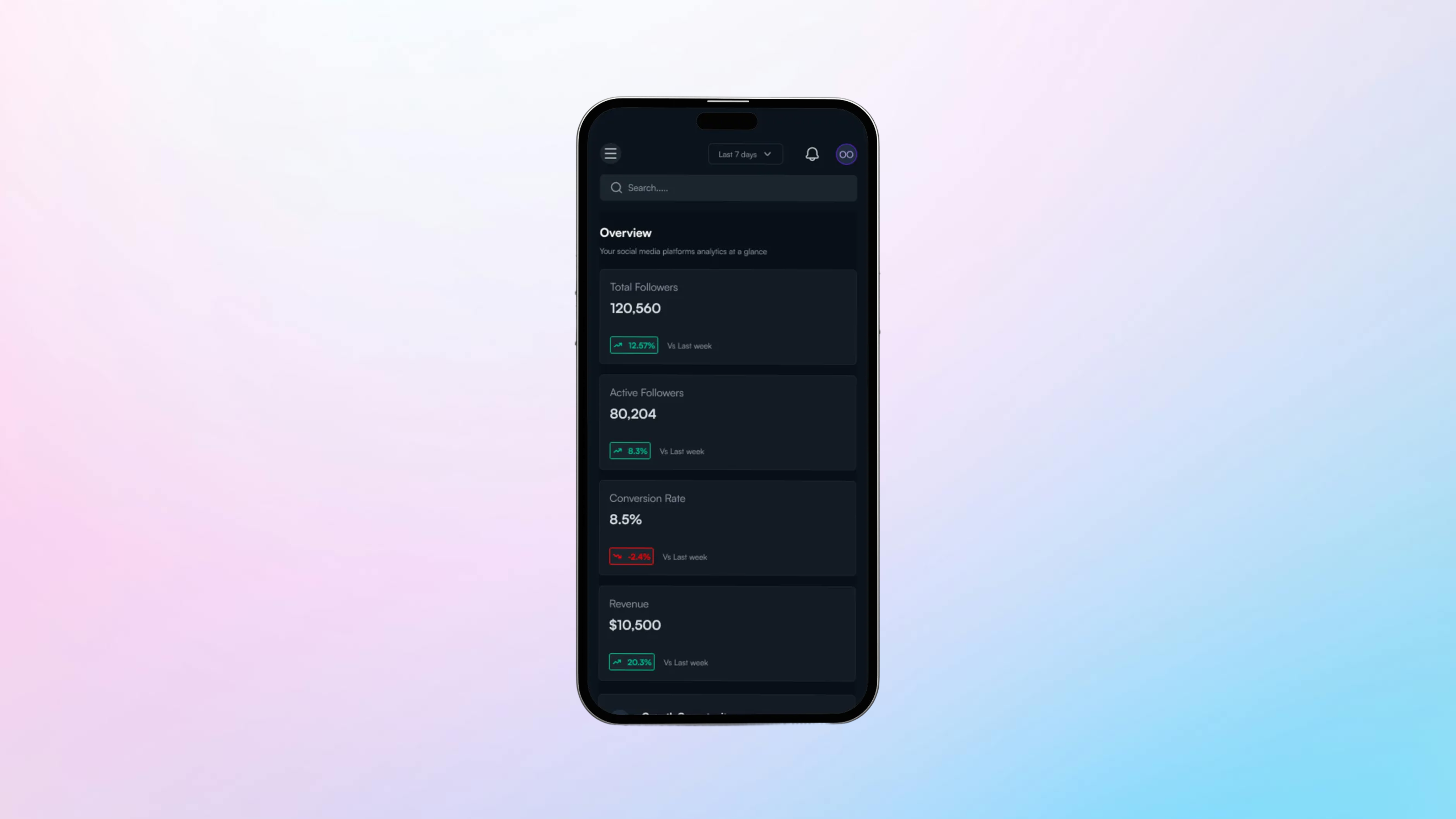
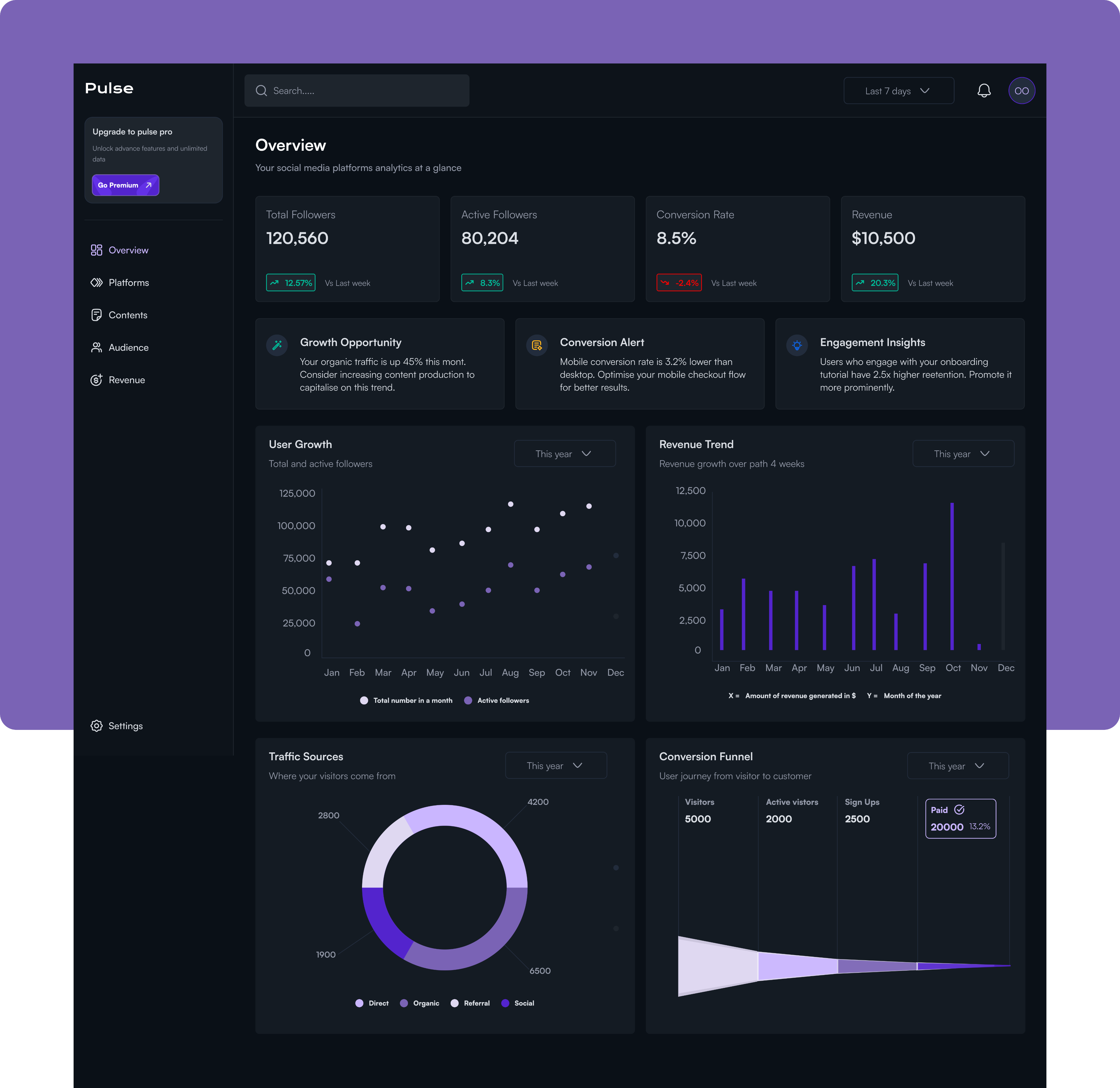
The Dashboard
The Pulse Overview Dashboard is a centralized command center for social media analytics, designed to give content creators, marketers, and business owners immediate visibility into their social media performance and business impact.
Problem this solves.
Social media managers and digital marketers struggle with fragmented data scattered across multiple platforms, Instagram, Twitter, TikTok, each with its own analytics interface.
This forces them to waste valuable time switching between dashboards to gather basic metrics, while critical trends and performance alerts remain buried and easy to miss.
More importantly, they struggle to connect their social media efforts to tangible business outcomes like revenue and conversions, making it difficult to justify budget, optimise strategy, or report meaningful results to stakeholders. Without a single source of truth, they're left making decisions based on incomplete information, missing growth opportunities, and unable to quickly identify what's working and what needs attention.
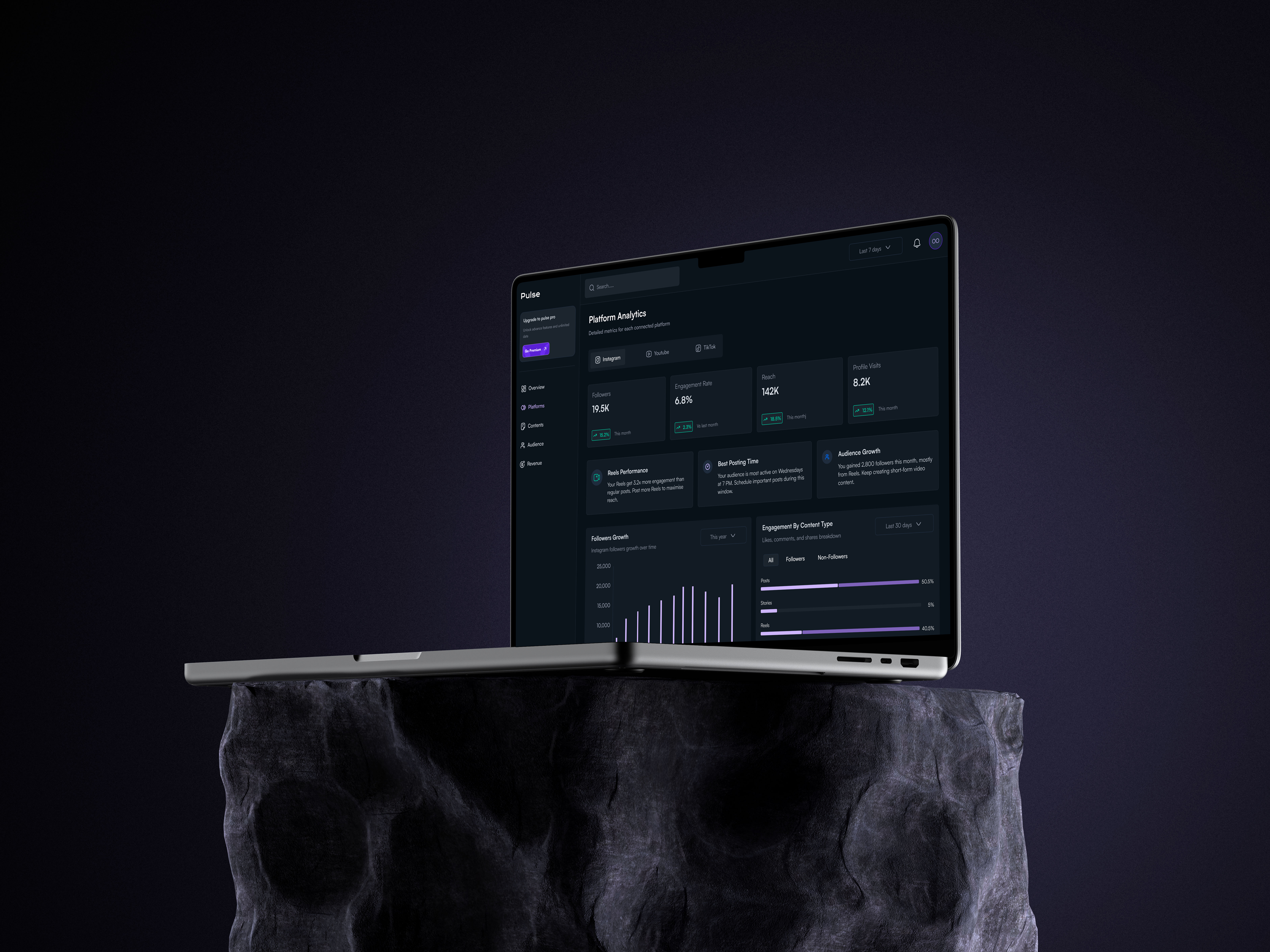
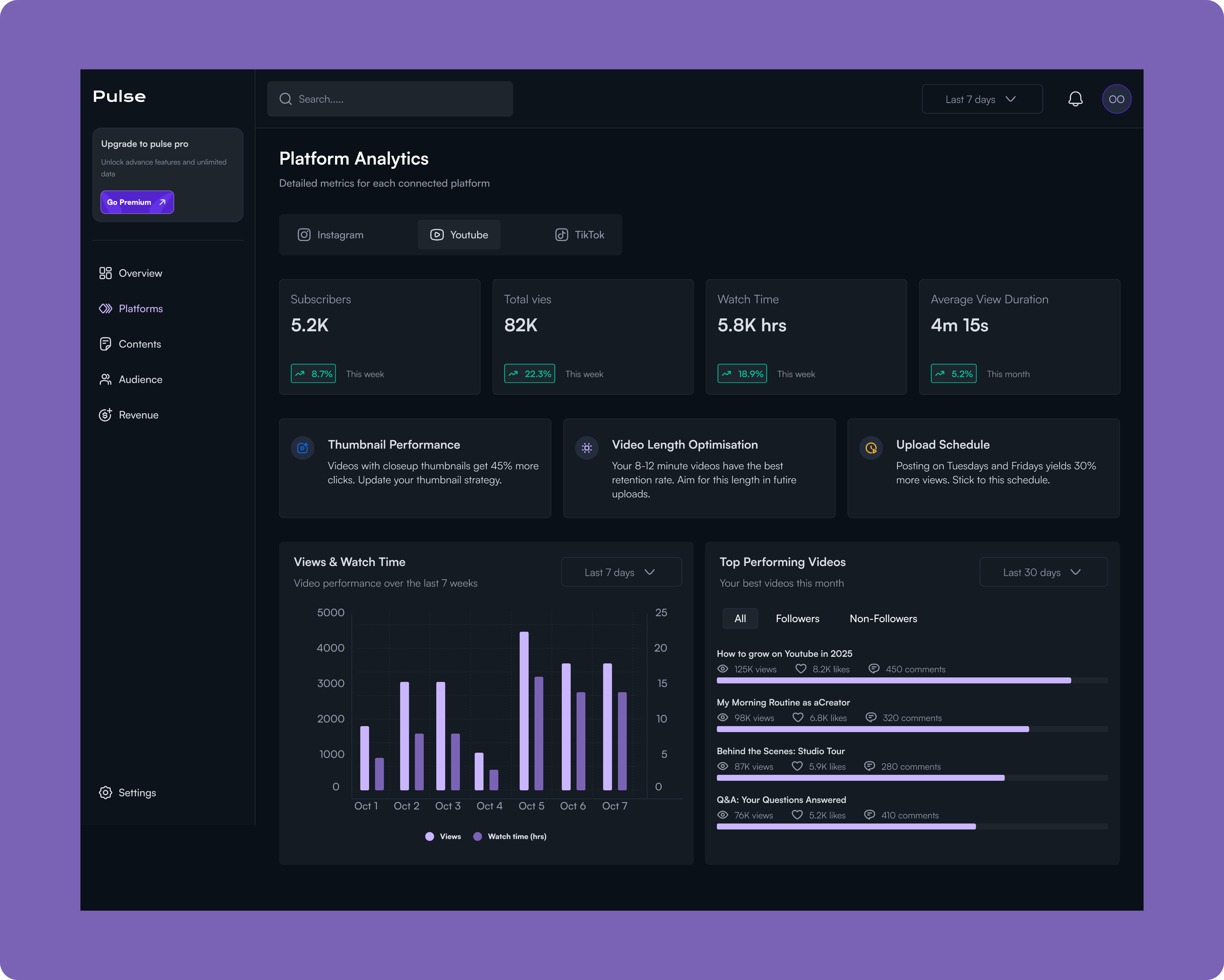
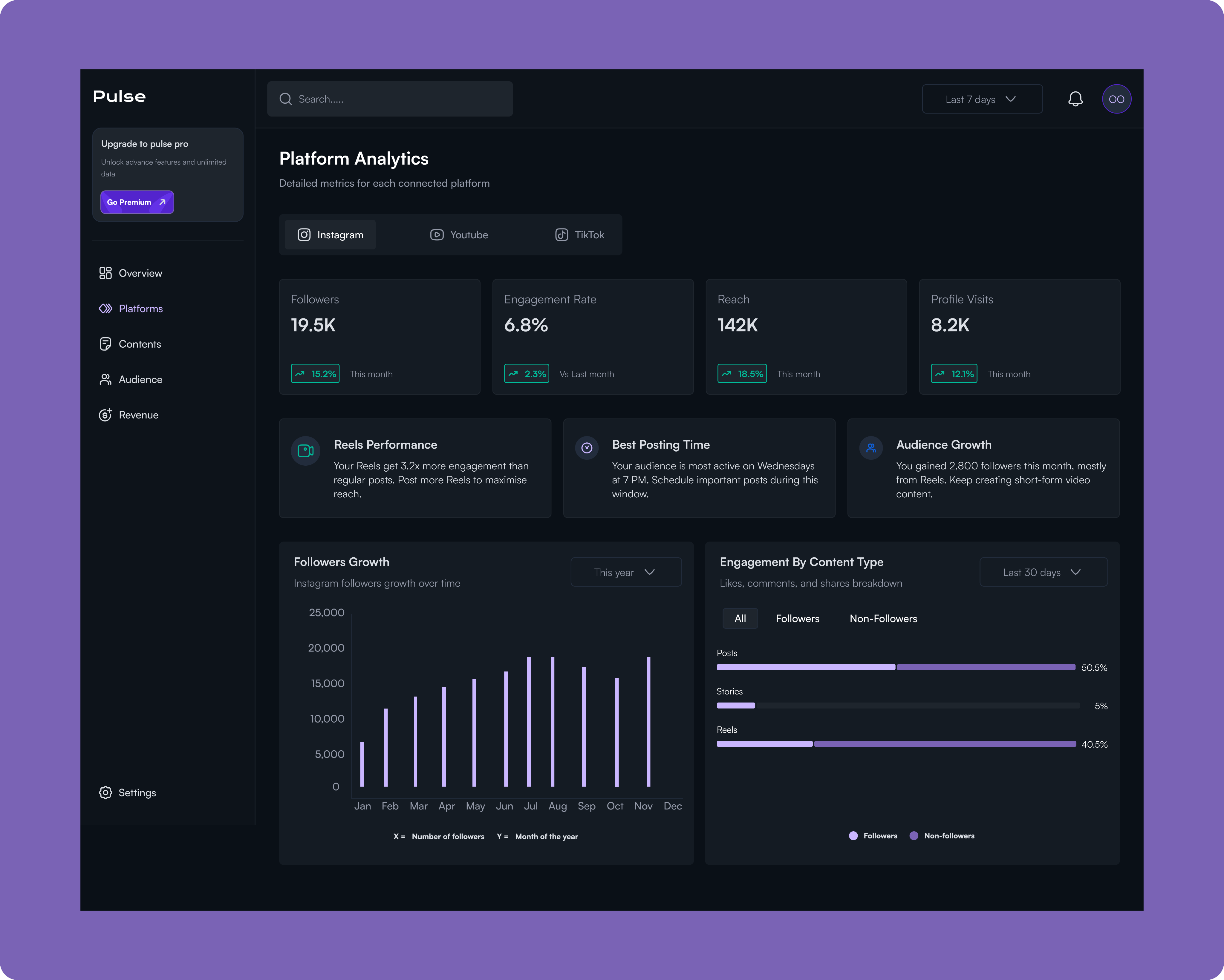
Platforms
Pulse's Platform Analytics transforms raw platform data into a strategic playbook for each channel by providing quick-access tabs for Instagram, YouTube, and TikTok that maintain a consistent analytical framework for effortless cross-platform comparison. Rather than overwhelming users with vanity metrics, the dashboard surfaces actionable intelligence cards that deliver specific recommendations, like identifying that Reels get 3.2x more engagement, pinpointing optimal posting windows based on actual audience behavior (Wednesdays at 7 PM), and breaking down audience growth by content type and source.
The engagement analysis reveals which formats resonate with followers versus non-followers, helping users understand whether they're optimising for reach or community building, while the growth trajectory visualisation correlates follower spikes with specific campaigns and reveals seasonal patterns. Together, these insights eliminate the guesswork in platform-specific strategy, enabling users to optimise their content mix, posting schedule, and format selection for each platform's unique algorithm and audience dynamics.
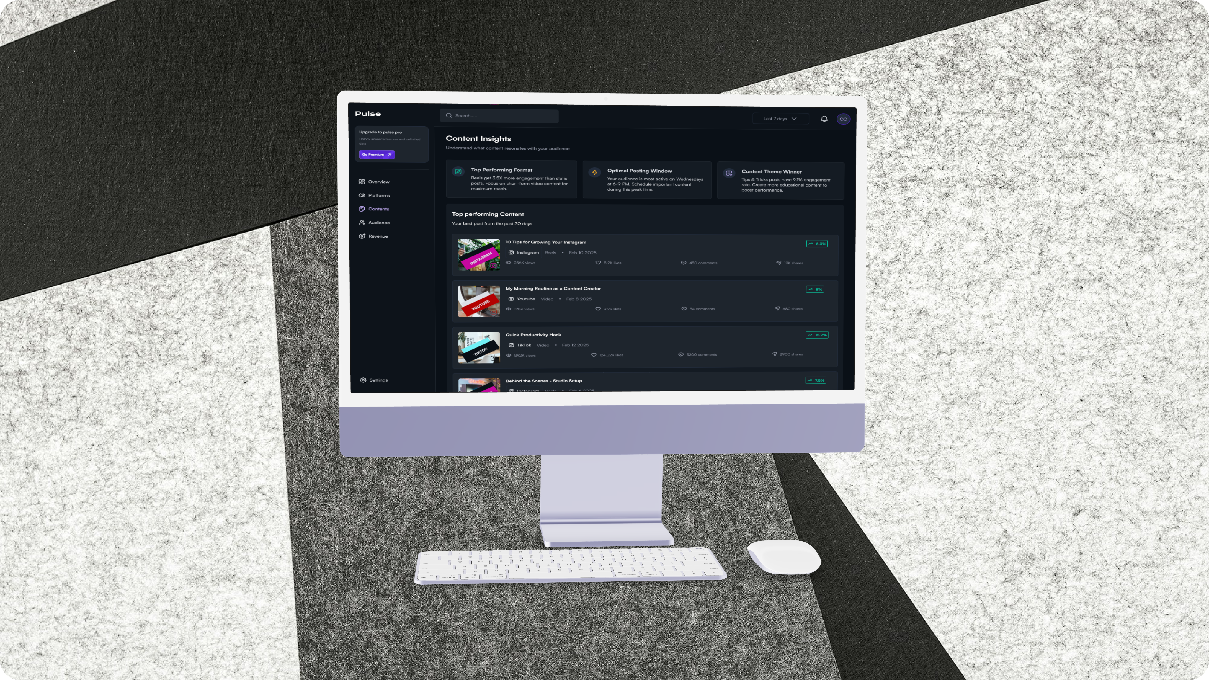
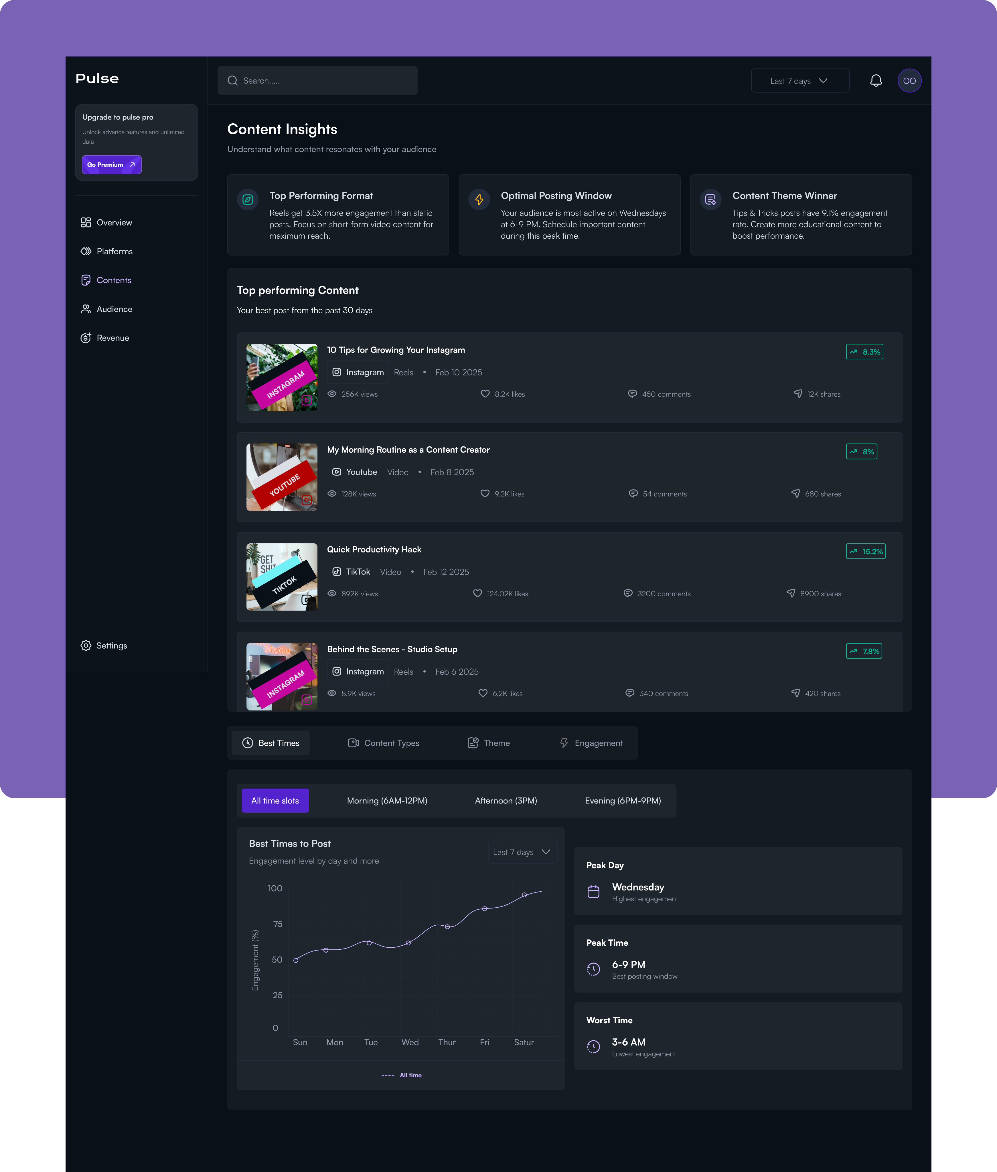
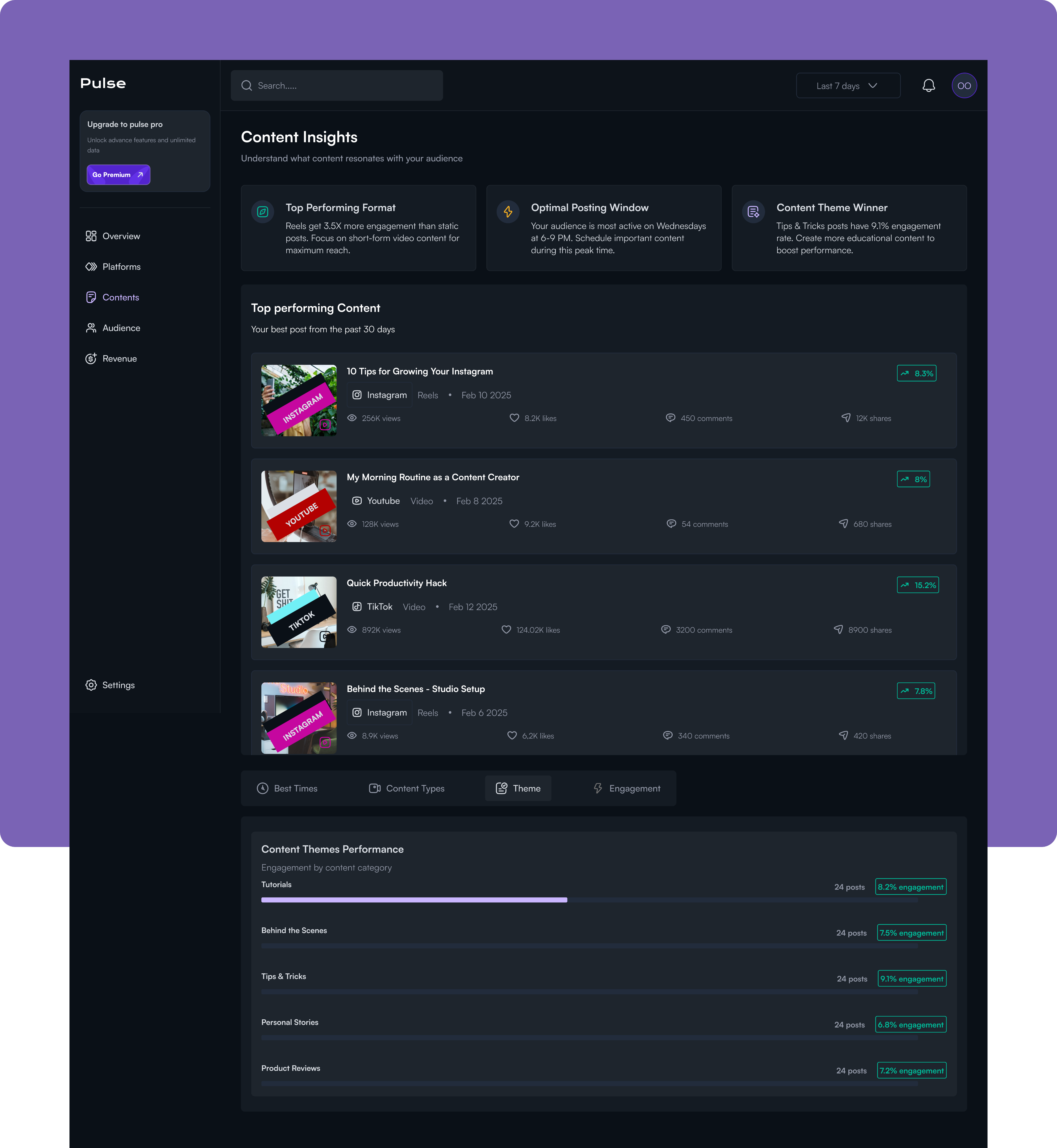
Contents
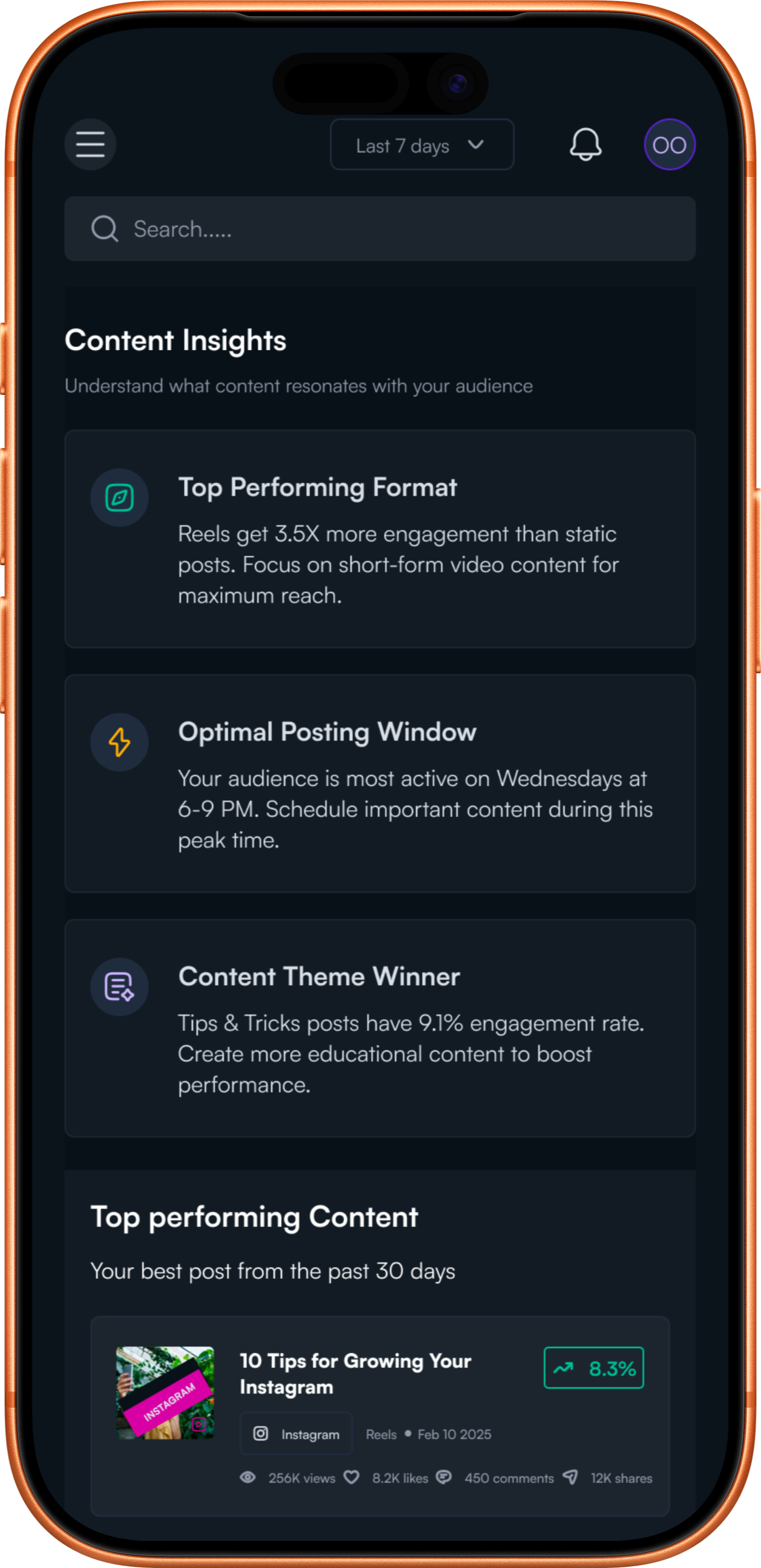
The Content Insights screen is a content strategy optimization hub that analyzes what resonates with your audience and when they're most receptive to it. This view transforms historical performance data into a repeatable playbook for creating and scheduling high-performing content.
Content Insights decodes the patterns behind successful content and surfaces a clear content strategy. At the top, three insight cards immediately identify the winning formula, highlighting that Reels drive 3.5x more engagement, Wednesday evenings at 6-9 PM are optimal posting windows, and Tips & Tricks content achieves a 91% engagement rate. The top-performing content feed showcases the best posts from the past 30 days with full engagement breakdowns, letting users analyse exactly what made each piece successful and identify common threads. The Best Times analyser goes deeper with time-slot filtering and day-by-day engagement curves that reveal peak performance windows (Wednesday at 6-9 PM) and periods to avoid (3-6 AM), while additional tabs for Content Types, Themes, and Engagement patterns provide multiple lenses for understanding audience preferences.
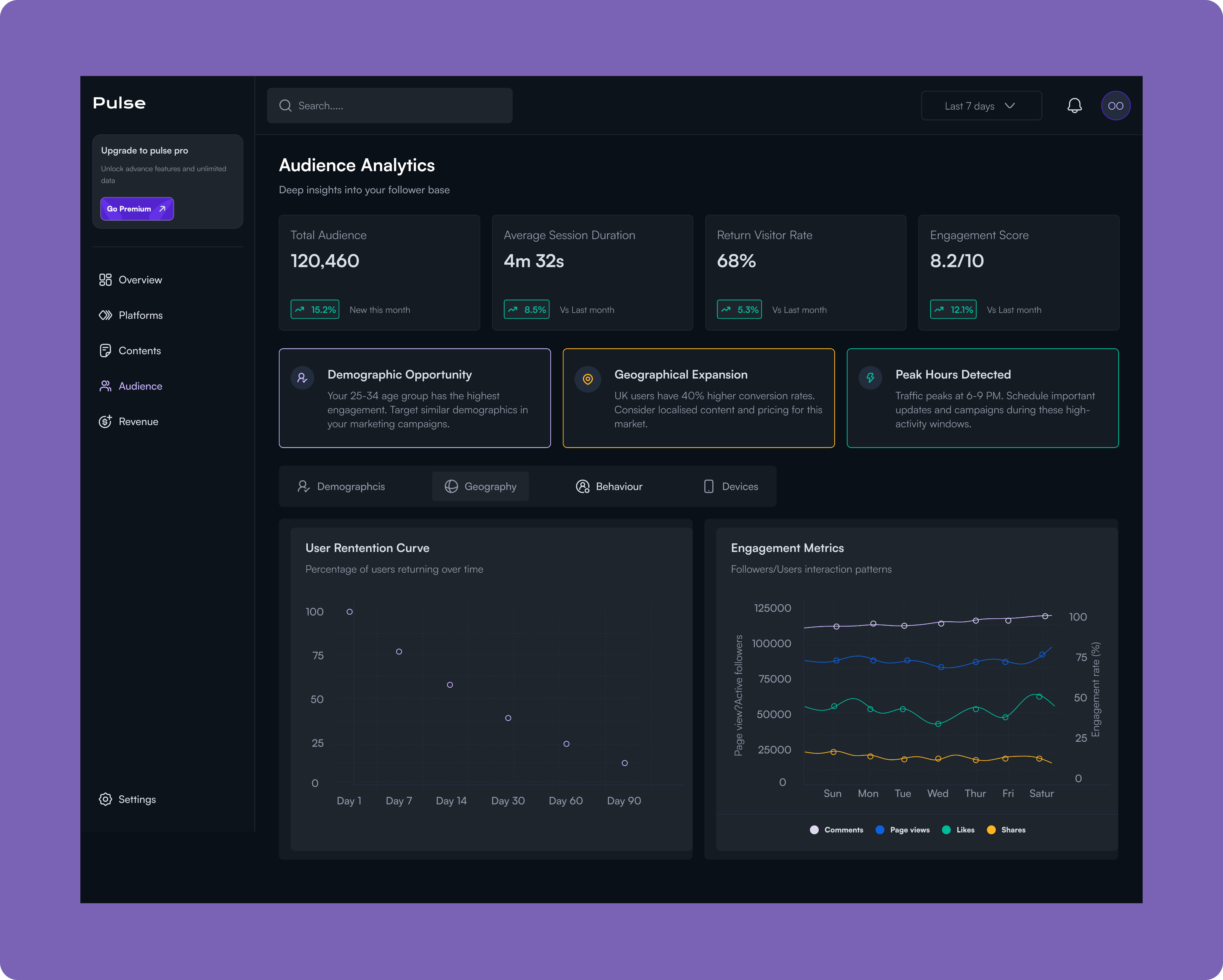
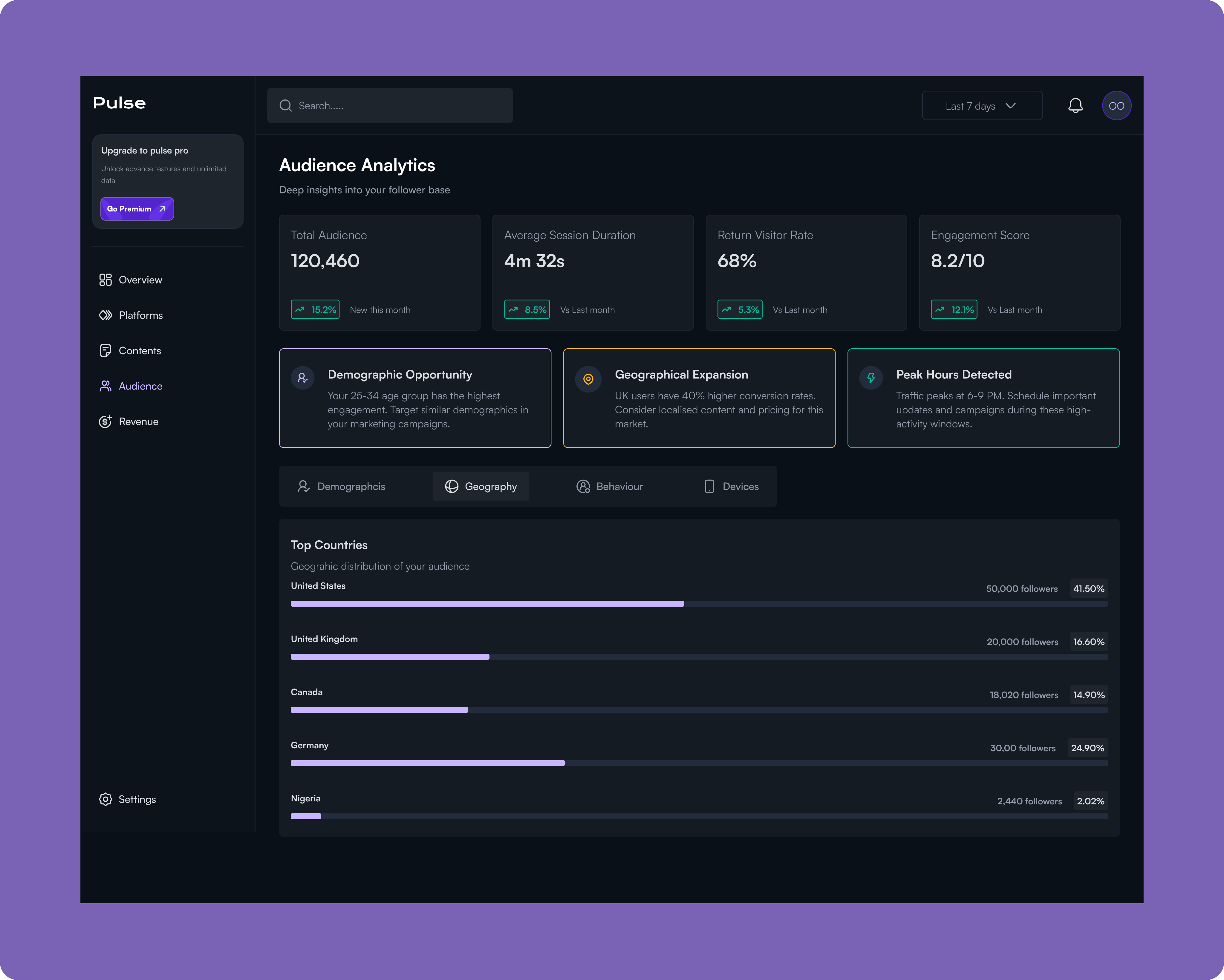
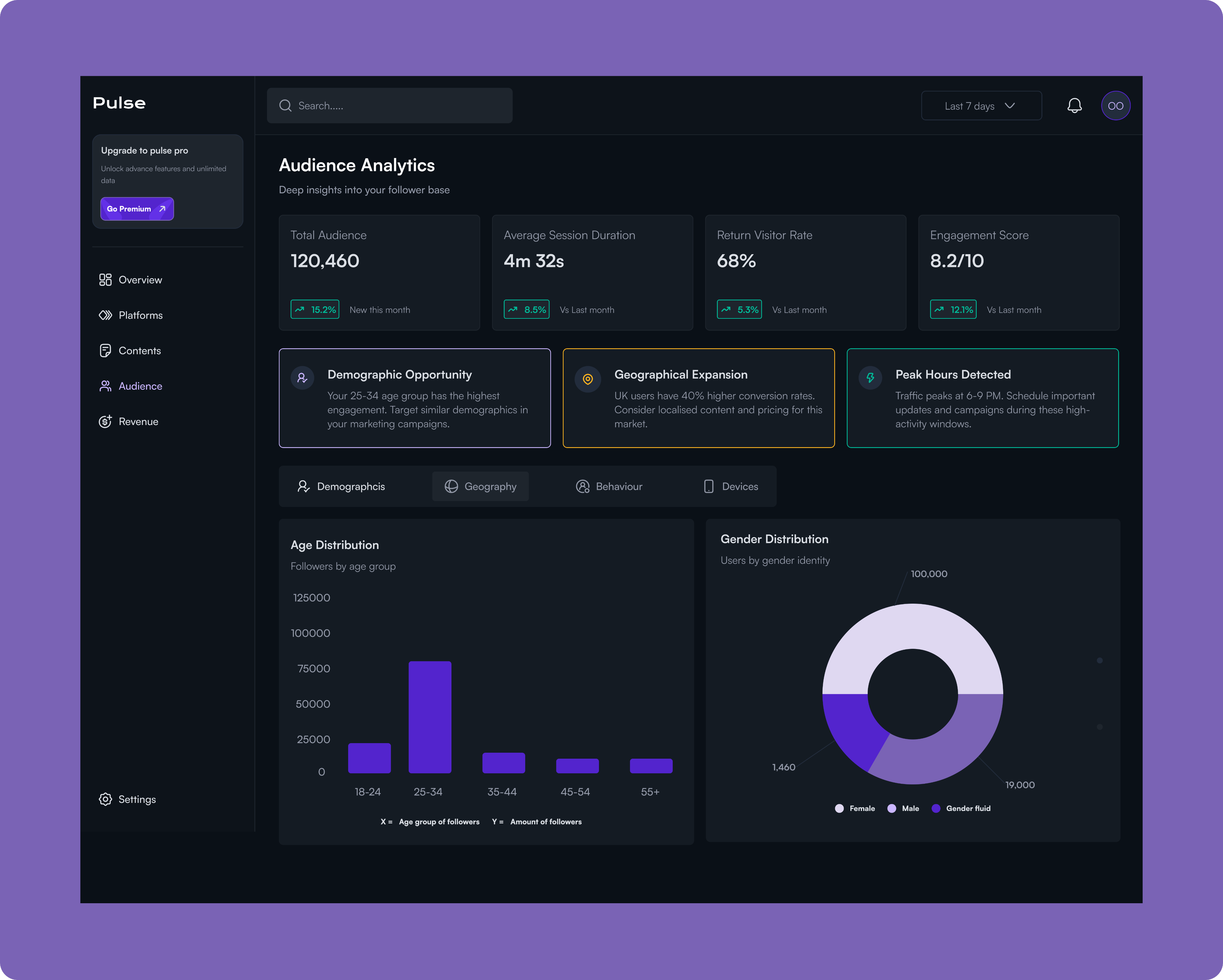
Audience
The Audience Analytics screen provides deep demographic and behavioral insights into your follower base, revealing who your audience is, where they're located, how they engage, and when they're most active. This intelligence enables data-driven decisions about content strategy, market expansion, and campaign targeting.
Revenue
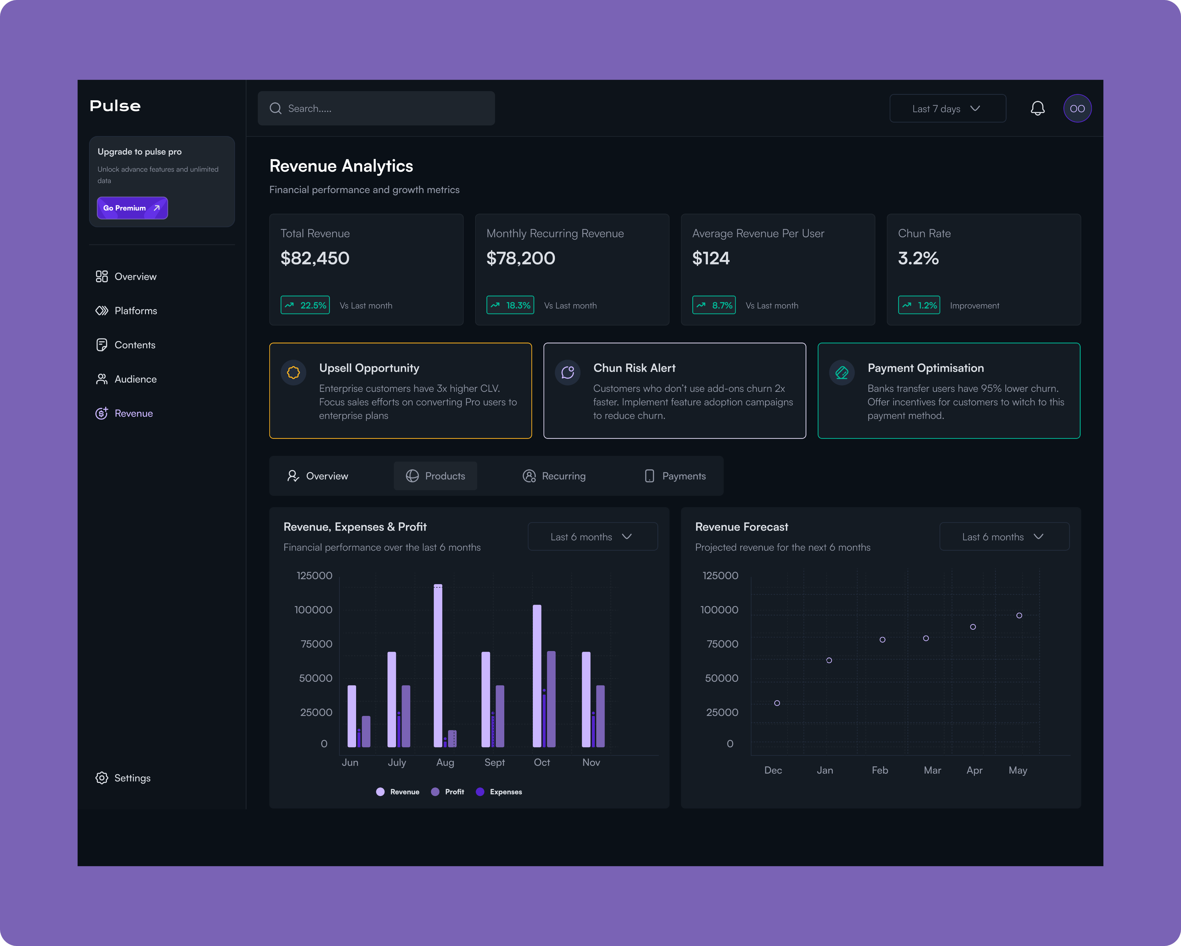
The Revenue Analytics screen is the financial command center that connects social media performance directly to business outcomes. It tracks total revenue, monthly recurring revenue, average revenue per user, and churn rate while surfacing critical opportunities to maximize customer lifetime value and reduce revenue leakage.
The dashboard immediately highlights actionable insights like upsell opportunities (Enterprise customers have 3x higher CLV), churn risk alerts (customers without add-ons churn 2x faster), and payment optimization strategies (bank transfer users have 95% lower churn).
With detailed breakdowns across Overview, Products, Recurring revenue, and Payment methods, plus historical performance tracking and forward-looking revenue forecasts for the next 6 months, this view solves the fundamental challenge of proving social media ROI by showing exactly how audience engagement translates into dollars and providing clear paths to revenue growth and retention improvement.
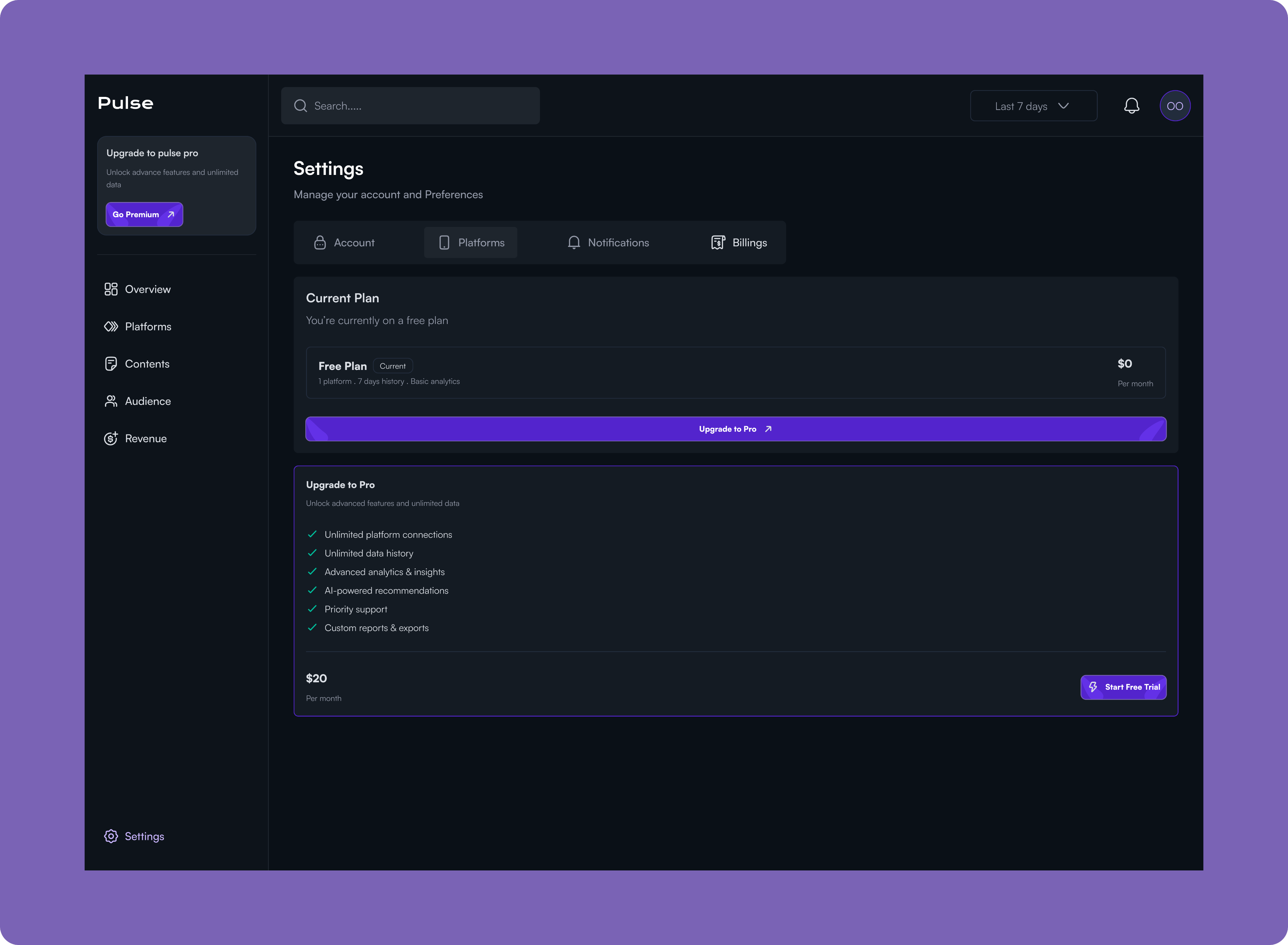
Settings
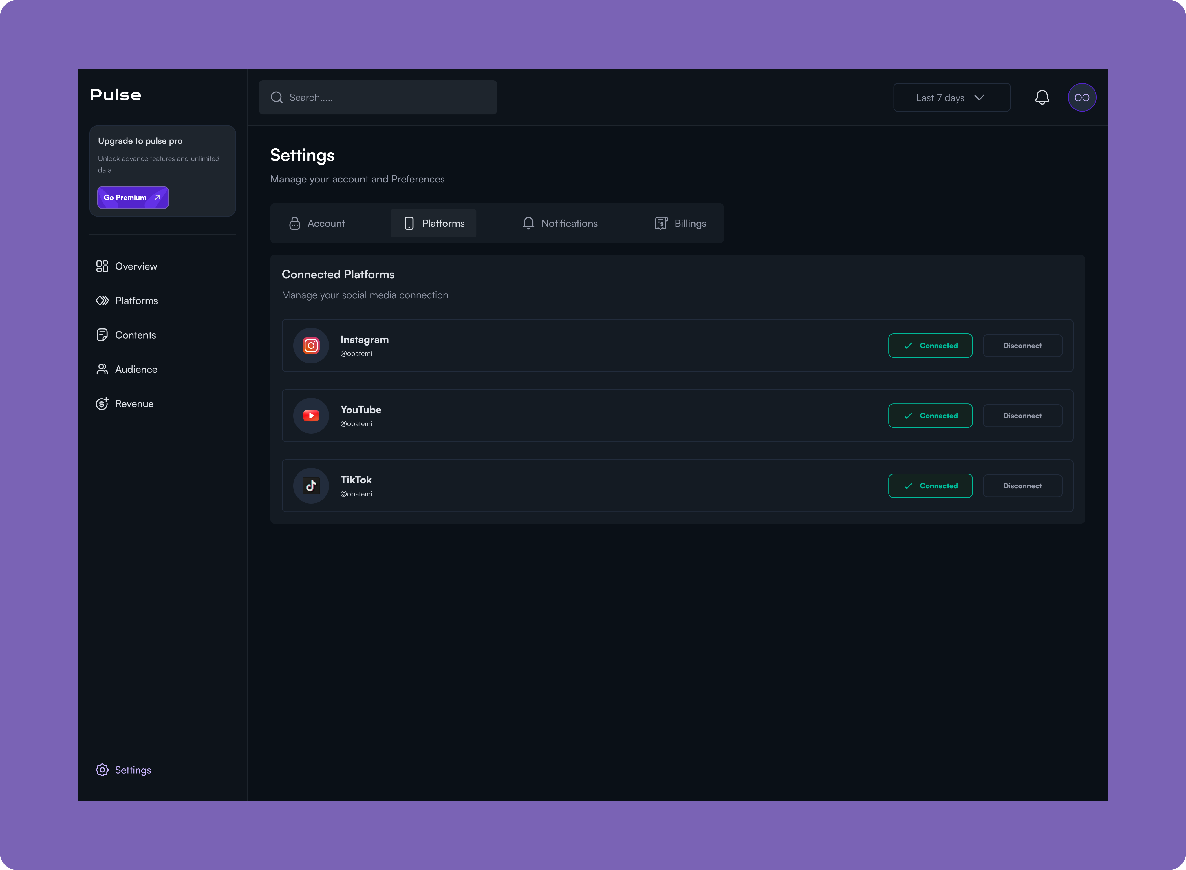
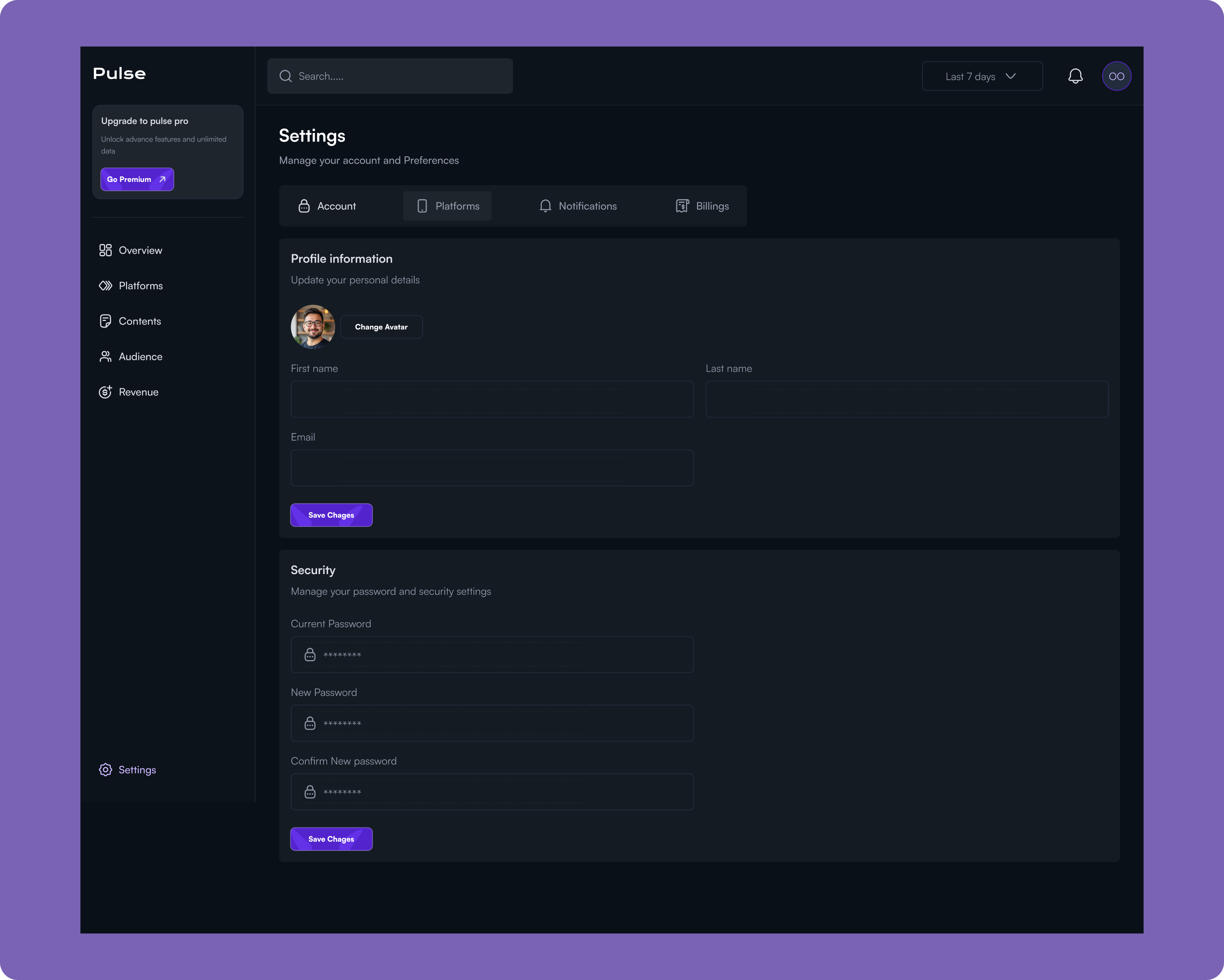
The Settings screen is the control center for managing your Pulse account, organized into four key areas: Account, Platforms, Notifications, and Billings. Under Account, users can update their profile information and manage security settings like password changes. The Platforms tab provides a centralized hub for connecting and managing social media accounts (Instagram, YouTube, TikTok), allowing users to link or disconnect platforms with simple toggle controls.
The Billings section displays the current subscription plan and provides a clear upgrade path to Pulse Pro, which unlocks advanced features like unlimited platform connections, unlimited data history, advanced analytics and insights, AI-powered recommendations, priority support, and custom reports and exports for $20/month.
This unified settings interface eliminates the friction of managing multiple configurations across different areas, giving users complete control over their account, integrations, and subscription in one accessible location.
Results and Impacts
North-Star Metric: Increased actionable insights delivered per user session.
Objective: Help users make faster, data-driven decisions
- KR: Reduced time-to-insight by 40% through prioritized KPIs and contextual trends
Objective: Boost user engagement and retention
- KR: Increased dashboard interactions by 30% with simplified navigation and responsive design
Objective: Improve cross-device usability
- KR: Enabled 60%+ of users to complete core analytics tasks entirely on mobile
Objective: Reduce cognitive overload
- KR: Introduced progressive disclosure, decreasing drop-offs and increasing depth-of-insight exploration
Impact: The platform transformed from a passive reporting tool into a decision-focused analytics system, enabling creators and businesses to act on insights confidently and consistently.
Lesson
This project reinforced the importance of designing for decisions, not dashboards.
Key Takeaways
- Good analytics design is less about visual complexity and more about prioritization.
- Responsive design isn’t just about layout, t’s about rethinking what information matters at different screen sizes.
- Introducing constraints (limited attention, short usage sessions) often leads to better product decisions.
- Strong product design bridges the gap between data and action.
Next Project
Grampets


How might we turn analytics from a source of overwhelm into a tool for confident decision-making?
Most creators and growing businesses don’t lack data, they lack clarity. Metrics live across multiple tools, dashboards are crowded with numbers, and insights are often buried beneath charts that demand more attention than users can afford. This project began with a simple question:
Context
AI product Web app
2025 sep - oct
Role
Product Designer
Platform
Desktop
(01)
Challenge
Creators and growing businesses depend heavily on data to guide content, marketing, and revenue decisions. However, most analytics tools are either:
- Too fragmented across multiple platforms
- Overloaded with metrics that lack clear context
- Difficult to use on smaller screens despite users frequently checking data on mobile
The core challenge was to design an analytics experience that turns complex, multi-source data into clear insights, without overwhelming users, while remaining fully usable across devices.
(02)
Approach & Design Framework
I approached this project with a decision-first design mindset, focusing on how users interpret data and take action rather than how much information is displayed. The work began with clear problem framing, recognising that users don’t need more metrics, but clearer signals that highlight what matters most. I prioritised user questions such as what’s happening now, how performance is changing over time, and where attention is needed next, using these to shape information hierarchy and layout. To reduce cognitive load without sacrificing depth, I applied progressive disclosure, surfacing high-level insights first and revealing detailed data only when users chose to explore further. Responsiveness was considered from the start, treating each breakpoint as a distinct experience to ensure key insights remained accessible during quick, on-the-go check-ins. Every design decision was evaluated through a single lens: whether it helped users move from data to confident action.
(03)
Research and Insights
I conducted lightweight qualitative research by reviewing existing analytics tools, analysing common user complaints, and synthesising patterns from creator and business workflows.
Key Insights
- Users don’t want more data; they want to know what matters right now.
- Many users check analytics in short sessions (often on mobile), meaning clarity and prioritization are critical.
- Raw numbers alone aren’t enough—users need context, trends, and comparisons to make decisions.
- Navigation complexity is a major friction point, especially for non-technical users.
(04)
Design Solution
I designed a responsive dashboard that prioritizes clarity, flexibility, and decision-making.
- A summary-first dashboard that surfaces the most important KPIs before deeper metrics.
- Clear visual hierarchy using charts, spacing, and typography to guide attention.
- Modular components that scale seamlessly across desktop, tablet, and mobile views.
- Contextual insights (trends, percentage changes, time comparisons) embedded directly into metrics.
- Simplified navigation to reduce cognitive load and allow users to move quickly between insights.
The overall system was designed to feel approachable for beginners while remaining powerful for advanced users.
The Dashboard
The Pulse Overview Dashboard is a centralized command center for social media analytics, designed to give content creators, marketers, and business owners immediate visibility into their social media performance and business impact.
Problem this solves.
Social media managers and digital marketers struggle with fragmented data scattered across multiple platforms, Instagram, Twitter, TikTok, each with its own analytics interface.
This forces them to waste valuable time switching between dashboards to gather basic metrics, while critical trends and performance alerts remain buried and easy to miss.
More importantly, they struggle to connect their social media efforts to tangible business outcomes like revenue and conversions, making it difficult to justify budget, optimise strategy, or report meaningful results to stakeholders. Without a single source of truth, they're left making decisions based on incomplete information, missing growth opportunities, and unable to quickly identify what's working and what needs attention.
Platforms
Pulse's Platform Analytics transforms raw platform data into a strategic playbook for each channel by providing quick-access tabs for Instagram, YouTube, and TikTok that maintain a consistent analytical framework for effortless cross-platform comparison. Rather than overwhelming users with vanity metrics, the dashboard surfaces actionable intelligence cards that deliver specific recommendations, like identifying that Reels get 3.2x more engagement, pinpointing optimal posting windows based on actual audience behavior (Wednesdays at 7 PM), and breaking down audience growth by content type and source.
The engagement analysis reveals which formats resonate with followers versus non-followers, helping users understand whether they're optimising for reach or community building, while the growth trajectory visualisation correlates follower spikes with specific campaigns and reveals seasonal patterns. Together, these insights eliminate the guesswork in platform-specific strategy, enabling users to optimise their content mix, posting schedule, and format selection for each platform's unique algorithm and audience dynamics.
Contents
The Content Insights screen is a content strategy optimization hub that analyzes what resonates with your audience and when they're most receptive to it. This view transforms historical performance data into a repeatable playbook for creating and scheduling high-performing content.
Content Insights decodes the patterns behind successful content and surfaces a clear content strategy. At the top, three insight cards immediately identify the winning formula, highlighting that Reels drive 3.5x more engagement, Wednesday evenings at 6-9 PM are optimal posting windows, and Tips & Tricks content achieves a 91% engagement rate. The top-performing content feed showcases the best posts from the past 30 days with full engagement breakdowns, letting users analyse exactly what made each piece successful and identify common threads. The Best Times analyser goes deeper with time-slot filtering and day-by-day engagement curves that reveal peak performance windows (Wednesday at 6-9 PM) and periods to avoid (3-6 AM), while additional tabs for Content Types, Themes, and Engagement patterns provide multiple lenses for understanding audience preferences.
Audience
The Audience Analytics screen provides deep demographic and behavioral insights into your follower base, revealing who your audience is, where they're located, how they engage, and when they're most active. This intelligence enables data-driven decisions about content strategy, market expansion, and campaign targeting.
Revenue
The Revenue Analytics screen is the financial command center that connects social media performance directly to business outcomes. It tracks total revenue, monthly recurring revenue, average revenue per user, and churn rate while surfacing critical opportunities to maximize customer lifetime value and reduce revenue leakage.
The dashboard immediately highlights actionable insights like upsell opportunities (Enterprise customers have 3x higher CLV), churn risk alerts (customers without add-ons churn 2x faster), and payment optimization strategies (bank transfer users have 95% lower churn).
With detailed breakdowns across Overview, Products, Recurring revenue, and Payment methods, plus historical performance tracking and forward-looking revenue forecasts for the next 6 months, this view solves the fundamental challenge of proving social media ROI by showing exactly how audience engagement translates into dollars and providing clear paths to revenue growth and retention improvement.
Settings
The Settings screen is the control center for managing your Pulse account, organized into four key areas: Account, Platforms, Notifications, and Billings. Under Account, users can update their profile information and manage security settings like password changes. The Platforms tab provides a centralized hub for connecting and managing social media accounts (Instagram, YouTube, TikTok), allowing users to link or disconnect platforms with simple toggle controls.
The Billings section displays the current subscription plan and provides a clear upgrade path to Pulse Pro, which unlocks advanced features like unlimited platform connections, unlimited data history, advanced analytics and insights, AI-powered recommendations, priority support, and custom reports and exports for $20/month.
This unified settings interface eliminates the friction of managing multiple configurations across different areas, giving users complete control over their account, integrations, and subscription in one accessible location.
Results and Impacts
North-Star Metric: Increased actionable insights delivered per user session.
Objective: Help users make faster, data-driven decisions
- KR: Reduced time-to-insight by 40% through prioritized KPIs and contextual trends
Objective: Boost user engagement and retention
- KR: Increased dashboard interactions by 30% with simplified navigation and responsive design
Objective: Improve cross-device usability
- KR: Enabled 60%+ of users to complete core analytics tasks entirely on mobile
Objective: Reduce cognitive overload
- KR: Introduced progressive disclosure, decreasing drop-offs and increasing depth-of-insight exploration
Impact: The platform transformed from a passive reporting tool into a decision-focused analytics system, enabling creators and businesses to act on insights confidently and consistently.
Lesson
This project reinforced the importance of designing for decisions, not dashboards.
Key Takeaways
- Good analytics design is less about visual complexity and more about prioritization.
- Responsive design isn’t just about layout, t’s about rethinking what information matters at different screen sizes.
- Introducing constraints (limited attention, short usage sessions) often leads to better product decisions.
- Strong product design bridges the gap between data and action.
Next Project
Grampets
