

Menu

How can we help businesses see, manage, and grow their subscriptions without friction.
This project is a responsive B2B subscription management web app designed for businesses who rely on recurring revenue.
The goal was simple: help users see, manage, and grow their subscriptions without friction.The product brings subscription setup, billing, customer management, and revenue insights into one intuitive dashboard, removing the chaos of juggling multiple tools.
Context
B2B Subscription managemnet app
2025 Jan - March
Role
Product Designer
Platform
Desktop
(01)
Challenge
Businesses were spending more time managing subscriptions than actually growing their businesses.
Businesses were spending more time managing subscriptions than actually growing their businesses.
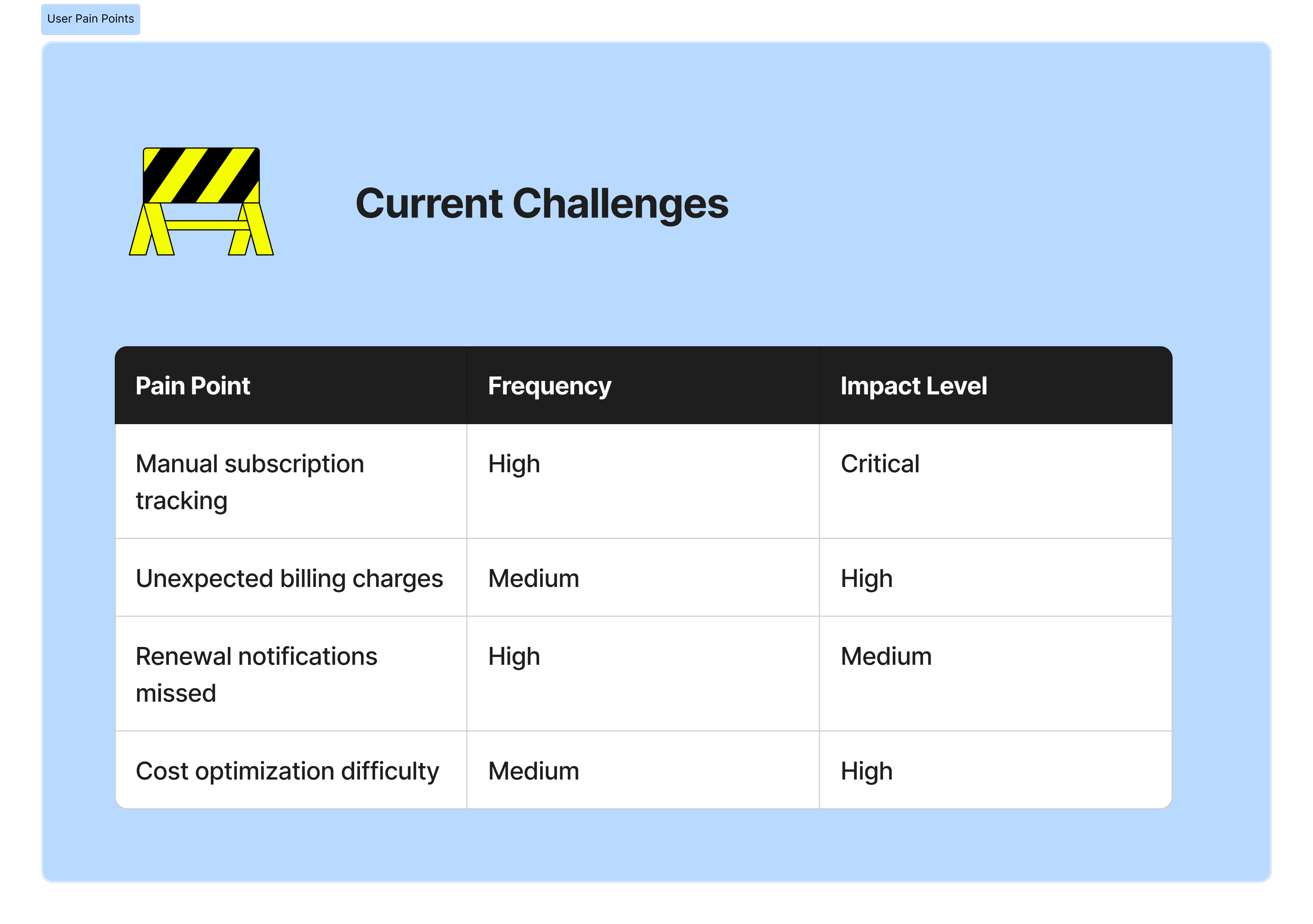
Key problems included:
- Scattered data across different tools
- Confusing billing and subscription workflows
- Poor visibility into revenue and customer behavior
- Dashboards that felt overwhelming, especially for non-technical users
The challenge was to simplify complexity without removing power, designing for both clarity and control.

(02)
Approach & Design Framework
I used a Lean UX approach, focusing on rapid learning, early validation, and continuous improvement rather than heavy documentation.
Instead of designing everything upfront, I:
- Framed assumptions about user needs and behaviors
- Designed small, testable solutions around the riskiest problems
- Iterated quickly based on feedback and observed usage patterns
The guiding principle was: design less, learn faster, improve continuously.
This helped ensure that every design decision was grounded in real user value, not assumptions.
(03)
Research and Insights
Research was lightweight but intentional, aligned with Lean UX principles.
I focused on:
- Competitive analysis of existing subscription tools
- Quick user feedback loops on early concepts
- Identifying friction points during key flows like onboarding and subscription management
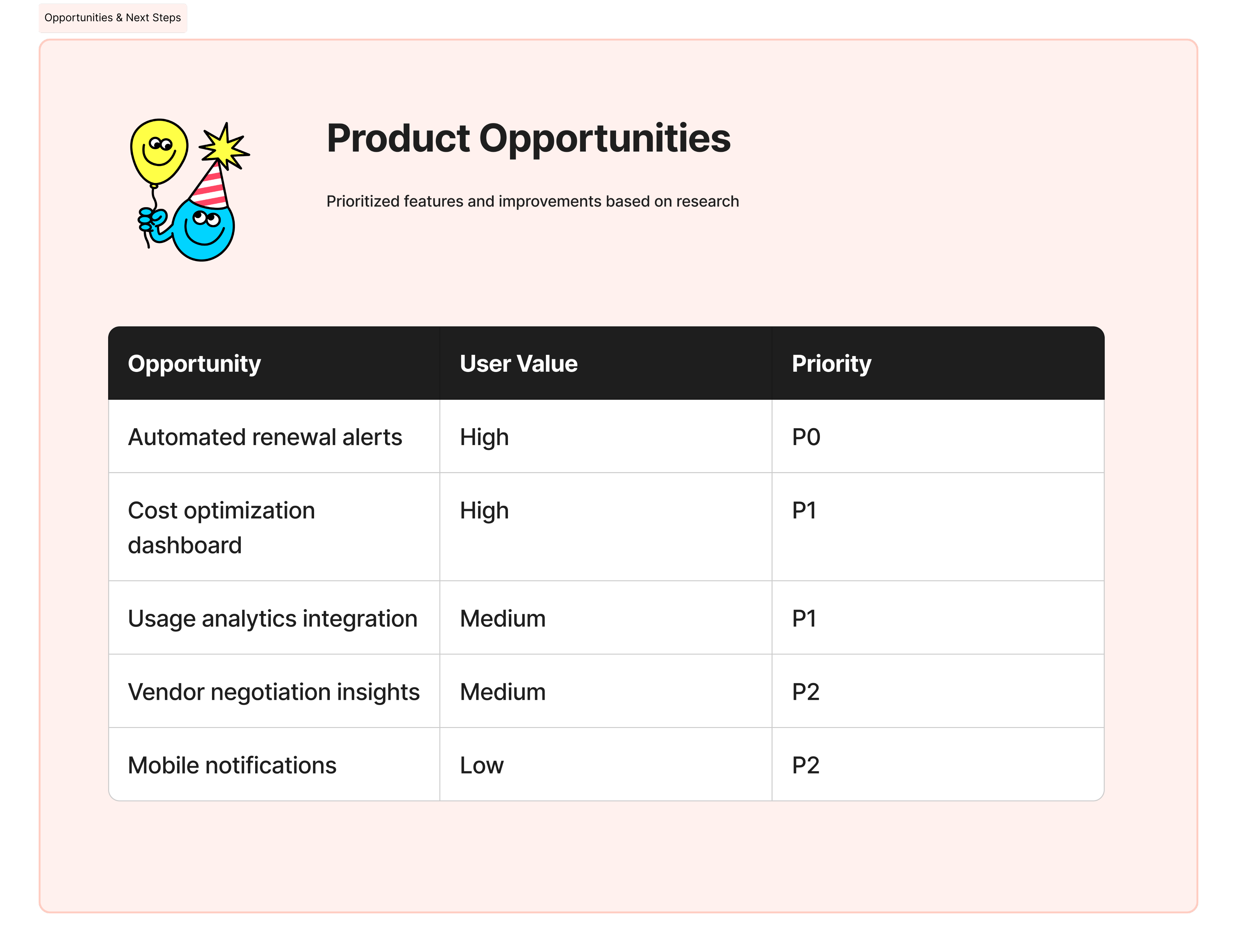
Key Insights
- Users cared more about clarity of revenue than feature depth
- Overloaded dashboards increased hesitation and errors
- Most users wanted reassurance they were “doing the right thing”
- The first dashboard view strongly influenced long-term engagement
(04)
Design Solution
The solution was a streamlined, insight-first experience that evolved through iteration.
Key design decisions included:
- A focused dashboard surfacing only essential metrics and actions
- Clear visual hierarchy to reduce cognitive load
- Simplified subscription flows with fewer decision points
- Responsive layouts designed for consistent use across devices
Each iteration removed friction, making the product feel lighter, faster, and easier to trust.
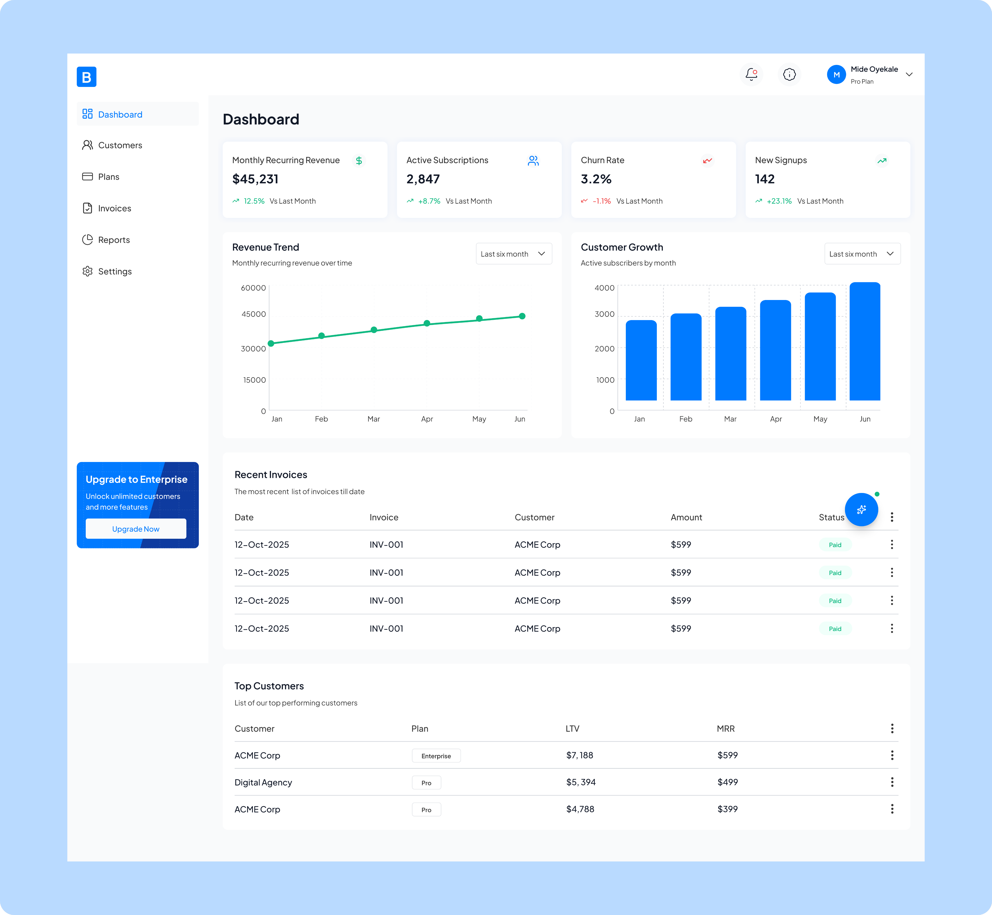
Home screen/Dashboard
The home screen solves the critical problem of fragmented business data by consolidating key performance metrics, ike monthly recurring revenue , active subscriptions, churn rate, and new signups, into a single, accessible view.
This is the analytics dashboard that provides subscription management and financial insights. It solves the critical problem of fragmented business data by consolidating key performance metrics, ike monthly recurring revenue , active subscriptions, churn rate, and new signups, into a single, accessible view.
The dashboard enables business owners and managers to quickly monitor revenue trends, track customer growth over time, review recent invoicing activity, and identify top-performing customers, all without having to pull reports from multiple systems or spreadsheets.
By visualizing month-over-month changes and growth patterns through charts and comparison metrics, it empowers data-driven decision-making and helps teams spot both opportunities and potential issues in their subscription business before they become significant problems.
Customers
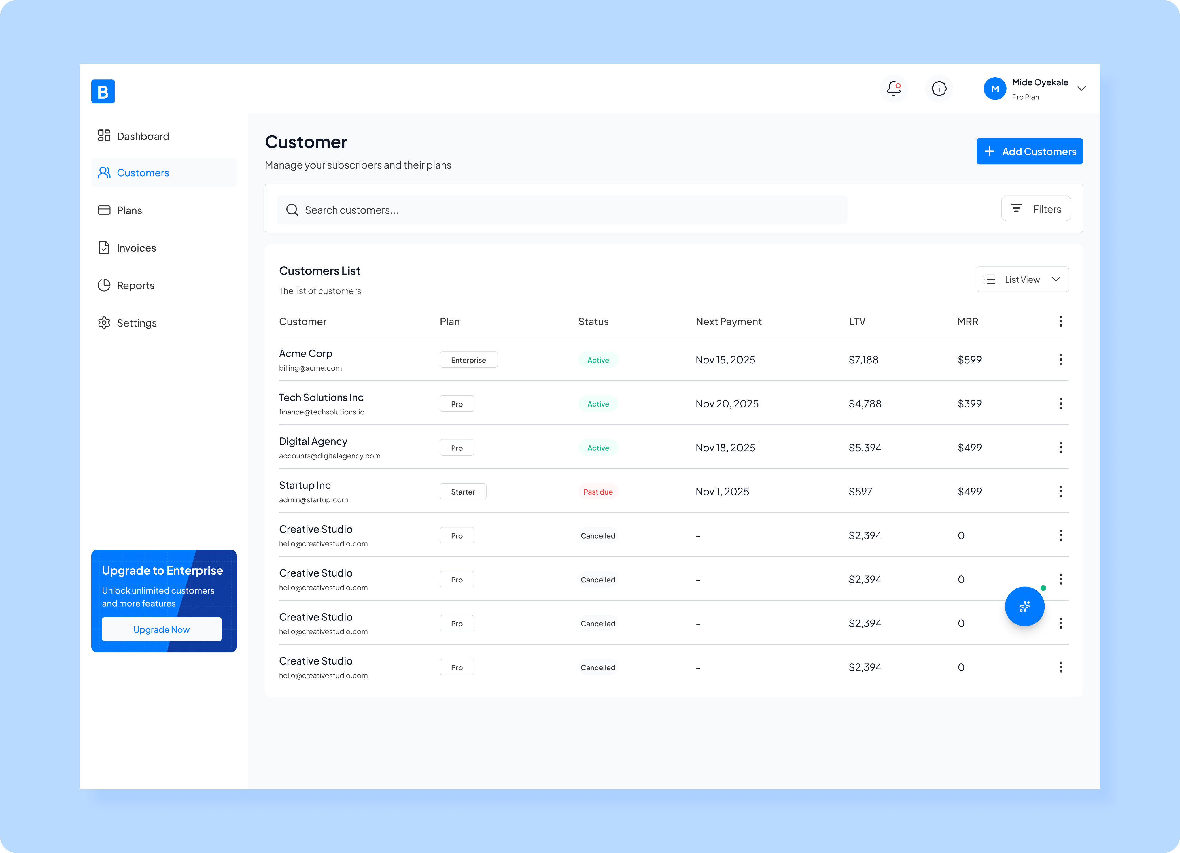
The customer page design solves the problem of scattered customer information by providing a comprehensive, sortable list where you can see each customer's subscription plan and monthly recurring revenue (MRR) all in one place.
This is a customer management screen that serves as the central hub for monitoring and administering all subscribers.
The screen enables quick search and filtering capabilities, making it easy to find specific customers or segment them by criteria, while the "Add Customers" button allows for seamless onboarding of new subscribers.
This unified view helps subscription businesses stay on top of their customer relationships, identify at-risk accounts (like those with "Past due" status), track revenue per customer, and take immediate action through the menu options on each row, eliminating the need to navigate through multiple systems or databases to manage subscriber data effectively.
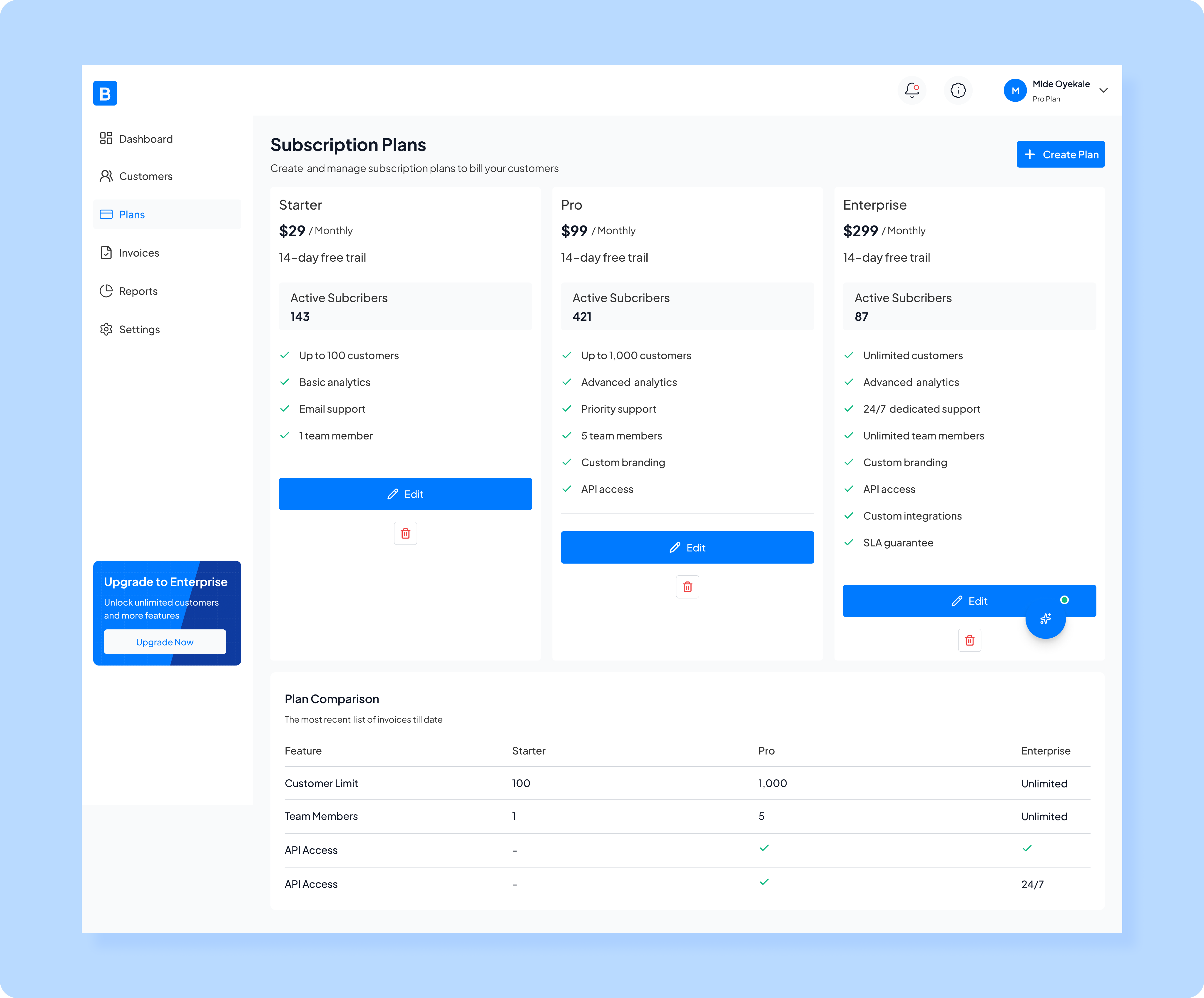
Plans
My design for plans page solves the problem of organizing and presenting multiple service offerings by providing a clear visual comparison of three plans, each with distinct features, customer limits, and support levels.
This is a subscription plan management screen that enables SaaS businesses to create, configure, and oversee their tiered pricing structure. It solves the problem of organizing and presenting multiple service offerings by providing a clear visual comparison of three plans, each with distinct features, customer limits, and support levels. The screen shows real-time active subscriber counts for each tier, helping businesses understand plan adoption and distribution. With the ability to edit individual plans, create new ones, and view a detailed feature comparison table below, this interface eliminates the complexity of managing multiple subscription tiers across different systems. It empowers businesses to quickly adjust their offerings, communicate value propositions clearly to potential customers, and make data-driven decisions about pricing strategy based on actual subscriber distribution across plans.
Invoices
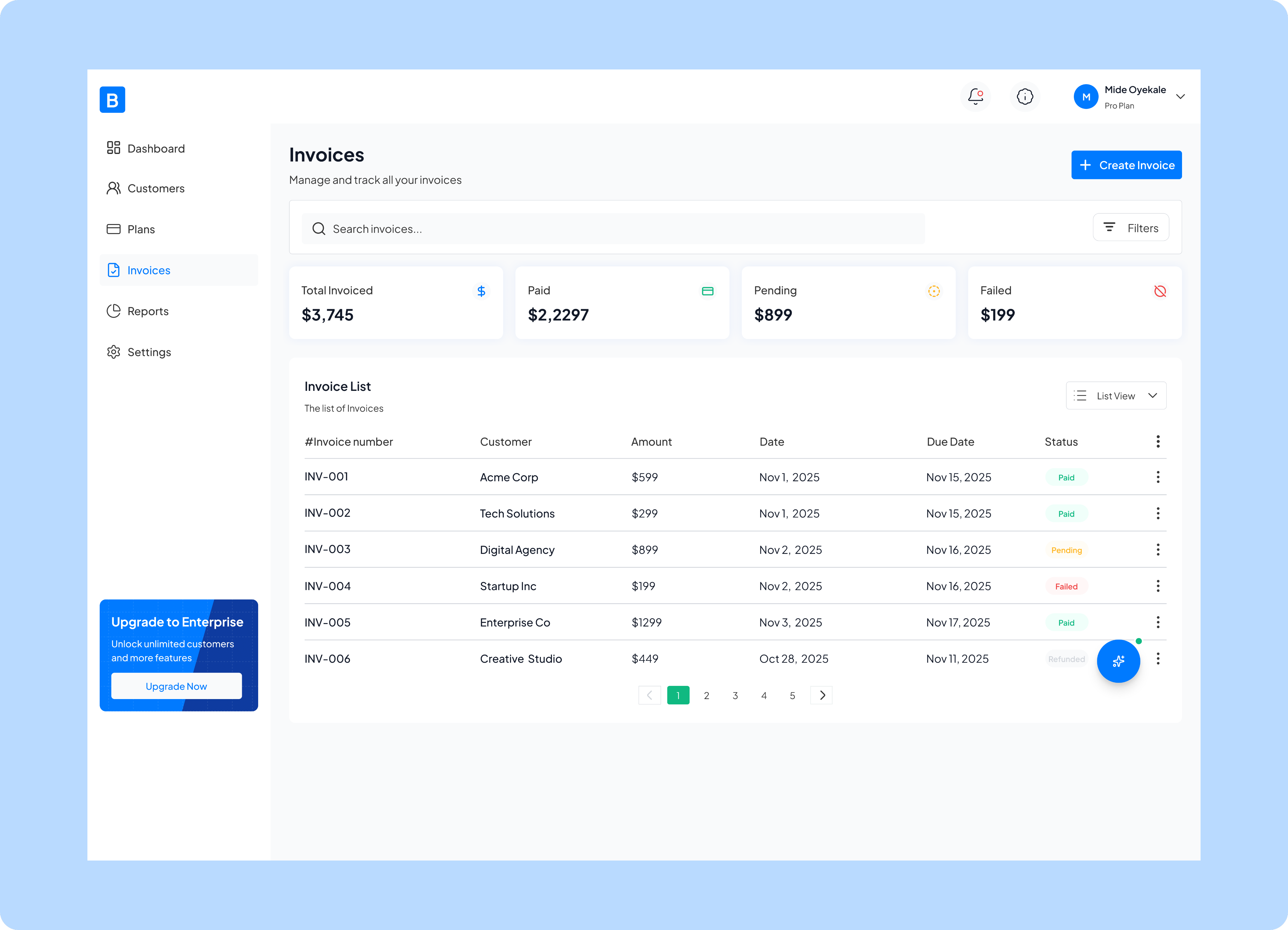
Invoice page design solves the problem of scattered financial records by providing a comprehensive overview of invoicing activity, including quick-glance financial summaries showing total invoiced, paid, pending, and failed ($199 amounts.
This is an invoice management screen that centralizes all billing and payment tracking for a subscription business. The detailed invoice list displays each transaction with its customer, amount, issue date, due date, and payment status, making it easy to identify which invoices need attention, particularly those that are pending or have failed. With search and filtering capabilities, pagination for large invoice volumes, and the ability to create new invoices directly from this screen, it eliminates the need for spreadsheets or multiple accounting tools, giving businesses a single source of truth for all their billing operations and helping them stay on top of cash flow and accounts receivable.
Reports
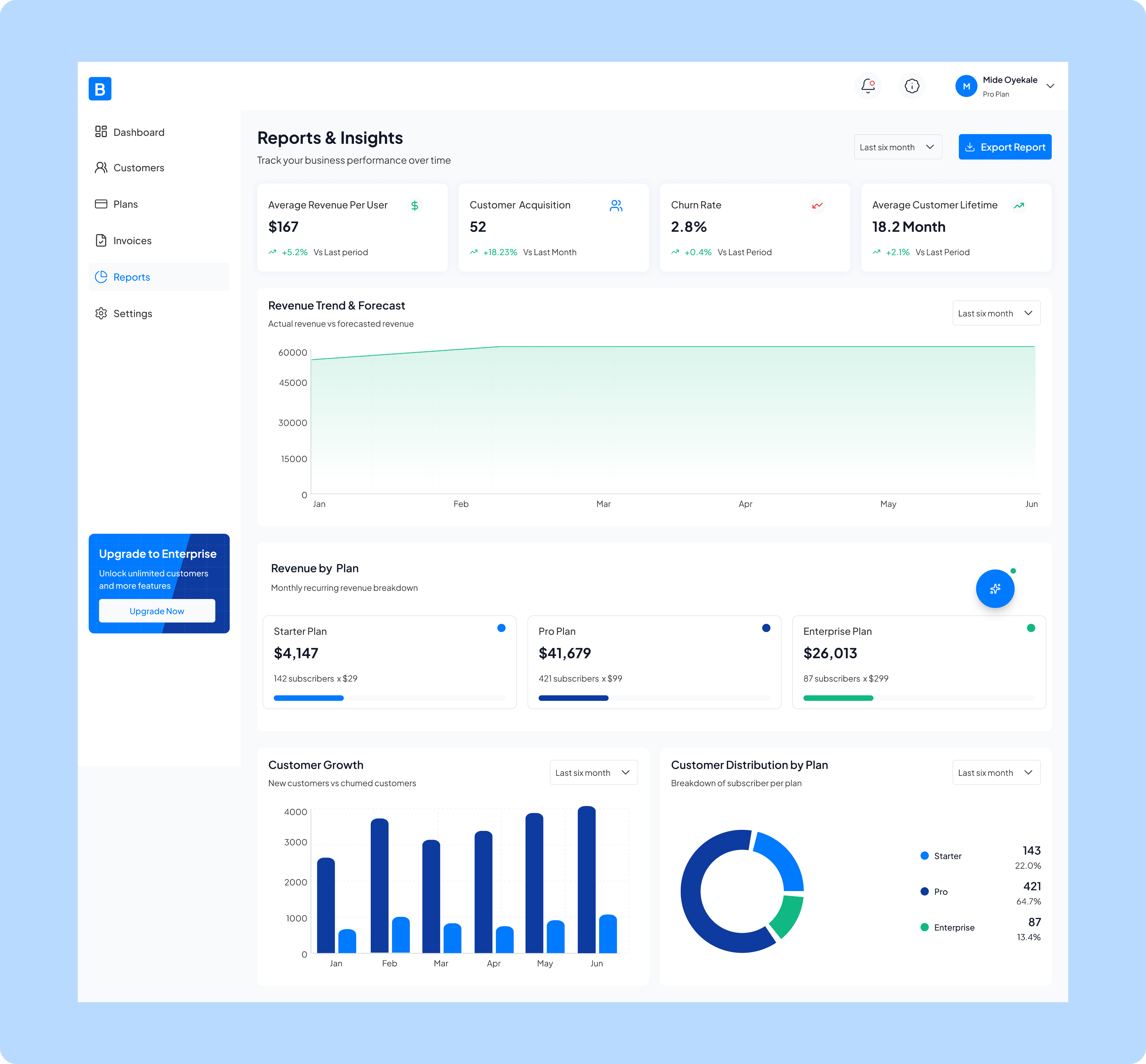
Reports page solves the problem of data overload by distilling complex metrics into clear visualizations and trends that business leaders can actually use to make informed decisions.
This is a comprehensive analytics and reporting dashboard that transforms raw subscription data into actionable business intelligence. It solves the problem of data overload by distilling complex metrics into clear visualizations and trends that business leaders can actually use to make informed decisions. The screen provides critical performance indicators like average revenue per user, customer acquisition rate, churn rate, and customer lifetime value, all with period-over-period comparisons to quickly spot positive or negative trends. It includes revenue forecasting to help with financial planning, breaks down revenue contribution by subscription tier, tracks customer growth patterns, and visualizes subscriber distribution across plans. By consolidating these insights in one exportable view with customizable time ranges, it eliminates the need for multiple disparate reports and spreadsheets, enabling executives and managers to monitor business health, identify growth opportunities, and respond to concerning trends, all at a glance.
Settings
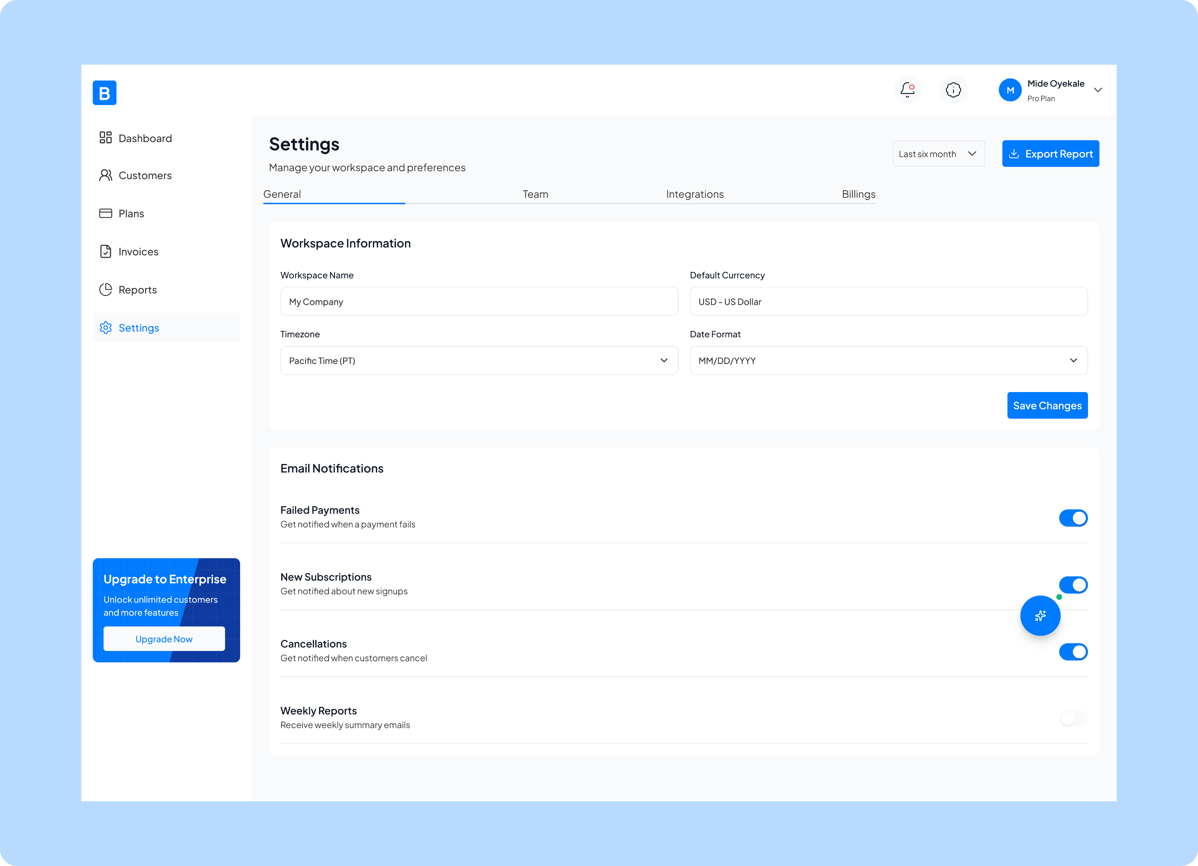
Settings page solves the problem of scattered preferences and notifications by centralizing all workspace configurations in one location, organized into clear tabs (General, Team, Integrations, and Billings).
This is a settings and configuration screen that serves as the control center for customizing how the subscription management platform operates for your business. It solves the problem of scattered preferences and notifications by centralizing all workspace configurations in one location, organized into clear tabs (General, Team, Integrations, and Billings).
The screen allows administrators to set fundamental business parameters like workspace name, timezone, currency, and date formats to ensure all financial data displays correctly for their region and operations. It also provides granular control over email notifications, letting users choose which critical events they want to be alerted about, such as failed payments, new subscriptions, or cancellations, so teams stay informed about important business events without being overwhelmed by unnecessary alerts.
This centralized configuration approach eliminates the confusion of hunting through multiple menus and ensures consistent settings across the entire platform.
Lesson
- Lean UX works best when learning is prioritized over perfection
- Early feedback prevents over-designing the wrong solutions
- Simplicity is a continuous process, not a one-time decision
- Strong design choices can directly influence retention and engagement
This project reinforced that the best products are shaped by learning, not assumptions.

Next Project
You4me


How can we help businesses see, manage, and grow their subscriptions without friction.
This project is a responsive B2B subscription management web app designed for businesses who rely on recurring revenue.
The goal was simple: help users see, manage, and grow their subscriptions without friction.The product brings subscription setup, billing, customer management, and revenue insights into one intuitive dashboard, removing the chaos of juggling multiple tools.
Context
B2B Subscription managemnet app
2025 Jan - March
Role
Product Designer
Platform
Desktop
(01)
Challenge
Businesses were spending more time managing subscriptions than actually growing their businesses.
Businesses were spending more time managing subscriptions than actually growing their businesses.
Key problems included:
- Scattered data across different tools
- Confusing billing and subscription workflows
- Poor visibility into revenue and customer behavior
- Dashboards that felt overwhelming, especially for non-technical users
The challenge was to simplify complexity without removing power, designing for both clarity and control.
(02)
Approach & Design Framework
I used a Lean UX approach, focusing on rapid learning, early validation, and continuous improvement rather than heavy documentation.
Instead of designing everything upfront, I:
- Framed assumptions about user needs and behaviors
- Designed small, testable solutions around the riskiest problems
- Iterated quickly based on feedback and observed usage patterns
The guiding principle was: design less, learn faster, improve continuously.
This helped ensure that every design decision was grounded in real user value, not assumptions.
(03)
Research and Insights
Research was lightweight but intentional, aligned with Lean UX principles.
I focused on:
- Competitive analysis of existing subscription tools
- Quick user feedback loops on early concepts
- Identifying friction points during key flows like onboarding and subscription management
Key Insights
- Users cared more about clarity of revenue than feature depth
- Overloaded dashboards increased hesitation and errors
- Most users wanted reassurance they were “doing the right thing”
- The first dashboard view strongly influenced long-term engagement
(04)
Design Solution
The solution was a streamlined, insight-first experience that evolved through iteration.
Key design decisions included:
- A focused dashboard surfacing only essential metrics and actions
- Clear visual hierarchy to reduce cognitive load
- Simplified subscription flows with fewer decision points
- Responsive layouts designed for consistent use across devices
Each iteration removed friction, making the product feel lighter, faster, and easier to trust.
Home screen/Dashboard
The home screen solves the critical problem of fragmented business data by consolidating key performance metrics, ike monthly recurring revenue , active subscriptions, churn rate, and new signups, into a single, accessible view.
This is the analytics dashboard that provides subscription management and financial insights. It solves the critical problem of fragmented business data by consolidating key performance metrics, ike monthly recurring revenue , active subscriptions, churn rate, and new signups, into a single, accessible view.
The dashboard enables business owners and managers to quickly monitor revenue trends, track customer growth over time, review recent invoicing activity, and identify top-performing customers, all without having to pull reports from multiple systems or spreadsheets.
By visualizing month-over-month changes and growth patterns through charts and comparison metrics, it empowers data-driven decision-making and helps teams spot both opportunities and potential issues in their subscription business before they become significant problems.
Customers
The customer page design solves the problem of scattered customer information by providing a comprehensive, sortable list where you can see each customer's subscription plan and monthly recurring revenue (MRR) all in one place.
This is a customer management screen that serves as the central hub for monitoring and administering all subscribers.
The screen enables quick search and filtering capabilities, making it easy to find specific customers or segment them by criteria, while the "Add Customers" button allows for seamless onboarding of new subscribers.
This unified view helps subscription businesses stay on top of their customer relationships, identify at-risk accounts (like those with "Past due" status), track revenue per customer, and take immediate action through the menu options on each row, eliminating the need to navigate through multiple systems or databases to manage subscriber data effectively.
Plans
My design for plans page solves the problem of organizing and presenting multiple service offerings by providing a clear visual comparison of three plans, each with distinct features, customer limits, and support levels.
This is a subscription plan management screen that enables SaaS businesses to create, configure, and oversee their tiered pricing structure. The screen shows real-time active subscriber counts for each tier, helping businesses understand plan adoption and distribution. With the ability to edit individual plans, create new ones, and view a detailed feature comparison table below, this interface eliminates the complexity of managing multiple subscription tiers across different systems. It empowers businesses to quickly adjust their offerings, communicate value propositions clearly to potential customers, and make data-driven decisions about pricing strategy based on actual subscriber distribution across plans.
Invoices
Invoice page design solves the problem of scattered financial records by providing a comprehensive overview of invoicing activity, including quick-glance financial summaries showing total invoiced, paid, pending, and failed ($199 amounts.
This is an invoice management screen that centralizes all billing and payment tracking for a subscription business. The detailed invoice list displays each transaction with its customer, amount, issue date, due date, and payment status, making it easy to identify which invoices need attention, particularly those that are pending or have failed. With search and filtering capabilities, pagination for large invoice volumes, and the ability to create new invoices directly from this screen, it eliminates the need for spreadsheets or multiple accounting tools, giving businesses a single source of truth for all their billing operations and helping them stay on top of cash flow and accounts receivable.
Reports
Reports page solves the problem of data overload by distilling complex metrics into clear visualizations and trends that business leaders can actually use to make informed decisions.
This is a comprehensive analytics and reporting dashboard that transforms raw subscription data into actionable business intelligence. The screen provides critical performance indicators like average revenue per user, customer acquisition rate, churn rate, and customer lifetime value, all with period-over-period comparisons to quickly spot positive or negative trends. It includes revenue forecasting to help with financial planning, breaks down revenue contribution by subscription tier, tracks customer growth patterns, and visualizes subscriber distribution across plans. By consolidating these insights in one exportable view with customizable time ranges, it eliminates the need for multiple disparate reports and spreadsheets, enabling executives and managers to monitor business health, identify growth opportunities, and respond to concerning trends, all at a glance.
Settings
Settings page solves the problem of scattered preferences and notifications by centralizing all workspace configurations in one location, organized into clear tabs (General, Team, Integrations, and Billings).
This is a settings and configuration screen that serves as the control center for customizing how the subscription management platform operates for your business. It solves the problem of scattered preferences and notifications by centralizing all workspace configurations in one location, organized into clear tabs (General, Team, Integrations, and Billings).
The screen allows administrators to set fundamental business parameters like workspace name, timezone, currency, and date formats to ensure all financial data displays correctly for their region and operations. It also provides granular control over email notifications, letting users choose which critical events they want to be alerted about, such as failed payments, new subscriptions, or cancellations, so teams stay informed about important business events without being overwhelmed by unnecessary alerts.
This centralized configuration approach eliminates the confusion of hunting through multiple menus and ensures consistent settings across the entire platform.
Lesson
- Lean UX works best when learning is prioritized over perfection
- Early feedback prevents over-designing the wrong solutions
- Simplicity is a continuous process, not a one-time decision
- Strong design choices can directly influence retention and engagement
This project reinforced that the best products are shaped by learning, not assumptions.
Next Project
You4me


How can we help businesses see, manage, and grow their subscriptions without friction.
This project is a responsive B2B subscription management web app designed for businesses who rely on recurring revenue.
The goal was simple: help users see, manage, and grow their subscriptions without friction.The product brings subscription setup, billing, customer management, and revenue insights into one intuitive dashboard, removing the chaos of juggling multiple tools.
Context
B2B Subscription managemnet app
2025 Jan - March
Role
Product Designer
Platform
Desktop
(01)
Challenge
Businesses were spending more time managing subscriptions than actually growing their businesses.
Key problems included:
- Scattered data across different tools
- Confusing billing and subscription workflows
- Poor visibility into revenue and customer behavior
- Dashboards that felt overwhelming, especially for non-technical users
The challenge was to simplify complexity without removing power, designing for both clarity and control.
(02)
Approach & Design Framework
I used a Lean UX approach, focusing on rapid learning, early validation, and continuous improvement rather than heavy documentation.
Instead of designing everything upfront, I:
- Framed assumptions about user needs and behaviors
- Designed small, testable solutions around the riskiest problems
- Iterated quickly based on feedback and observed usage patterns
The guiding principle was: design less, learn faster, improve continuously.
This helped ensure that every design decision was grounded in real user value, not assumptions.
(03)
Research and Insights
Research was lightweight but intentional, aligned with Lean UX principles.
I focused on:
- Competitive analysis of existing subscription tools
- Quick user feedback loops on early concepts
- Identifying friction points during key flows like onboarding and subscription management
Key Insights
- Users cared more about clarity of revenue than feature depth
- Overloaded dashboards increased hesitation and errors
- Most users wanted reassurance they were “doing the right thing”
- The first dashboard view strongly influenced long-term engagement
(04)
Design Solution
The solution was a streamlined, insight-first experience that evolved through iteration.
Key design decisions included:
- A focused dashboard surfacing only essential metrics and actions
- Clear visual hierarchy to reduce cognitive load
- Simplified subscription flows with fewer decision points
- Responsive layouts designed for consistent use across devices
Each iteration removed friction, making the product feel lighter, faster, and easier to trust.
Home screen/Dashboard
The home screen solves the critical problem of fragmented business data by consolidating key performance metrics, ike monthly recurring revenue , active subscriptions, churn rate, and new signups, into a single, accessible view.
This is the analytics dashboard that provides subscription management and financial insights.
The dashboard enables business owners and managers to quickly monitor revenue trends, track customer growth over time, review recent invoicing activity, and identify top-performing customers, all without having to pull reports from multiple systems or spreadsheets.
By visualizing month-over-month changes and growth patterns through charts and comparison metrics, it empowers data-driven decision-making and helps teams spot both opportunities and potential issues in their subscription business before they become significant problems.
Customers
The customer page design solves the problem of scattered customer information by providing a comprehensive, sortable list where you can see each customer's subscription plan and monthly recurring revenue (MRR) all in one place.
This is a customer management screen that serves as the central hub for monitoring and administering all subscribers.
The screen enables quick search and filtering capabilities, making it easy to find specific customers or segment them by criteria, while the "Add Customers" button allows for seamless onboarding of new subscribers.
This unified view helps subscription businesses stay on top of their customer relationships, identify at-risk accounts (like those with "Past due" status), track revenue per customer, and take immediate action through the menu options on each row, eliminating the need to navigate through multiple systems or databases to manage subscriber data effectively.
Plans
My design for plans page solves the problem of organizing and presenting multiple service offerings by providing a clear visual comparison of three plans, each with distinct features, customer limits, and support levels.
This is a subscription plan management screen that enables SaaS businesses to create, configure, and oversee their tiered pricing structure. The screen shows real-time active subscriber counts for each tier, helping businesses understand plan adoption and distribution. With the ability to edit individual plans, create new ones, and view a detailed feature comparison table below, this interface eliminates the complexity of managing multiple subscription tiers across different systems. It empowers businesses to quickly adjust their offerings, communicate value propositions clearly to potential customers, and make data-driven decisions about pricing strategy based on actual subscriber distribution across plans.
Invoices
Invoice page design solves the problem of scattered financial records by providing a comprehensive overview of invoicing activity, including quick-glance financial summaries showing total invoiced, paid, pending, and failed ($199 amounts.
This is an invoice management screen that centralizes all billing and payment tracking for a subscription business. The detailed invoice list displays each transaction with its customer, amount, issue date, due date, and payment status, making it easy to identify which invoices need attention, particularly those that are pending or have failed. With search and filtering capabilities, pagination for large invoice volumes, and the ability to create new invoices directly from this screen, it eliminates the need for spreadsheets or multiple accounting tools, giving businesses a single source of truth for all their billing operations and helping them stay on top of cash flow and accounts receivable.
Reports
Reports page solves the problem of data overload by distilling complex metrics into clear visualizations and trends that business leaders can actually use to make informed decisions.
This is a comprehensive analytics and reporting dashboard that transforms raw subscription data into actionable business intelligence. The screen provides critical performance indicators like average revenue per user, customer acquisition rate, churn rate, and customer lifetime value, all with period-over-period comparisons to quickly spot positive or negative trends. It includes revenue forecasting to help with financial planning, breaks down revenue contribution by subscription tier, tracks customer growth patterns, and visualizes subscriber distribution across plans. By consolidating these insights in one exportable view with customizable time ranges, it eliminates the need for multiple disparate reports and spreadsheets, enabling executives and managers to monitor business health, identify growth opportunities, and respond to concerning trends, all at a glance.
Settings
Settings page solves the problem of scattered preferences and notifications by centralizing all workspace configurations in one location, organized into clear tabs (General, Team, Integrations, and Billings).
This is a settings and configuration screen that serves as the control center for customizing how the subscription management platform operates for your business.
The screen allows administrators to set fundamental business parameters like workspace name, timezone, currency, and date formats to ensure all financial data displays correctly for their region and operations. It also provides granular control over email notifications, letting users choose which critical events they want to be alerted about, such as failed payments, new subscriptions, or cancellations, so teams stay informed about important business events without being overwhelmed by unnecessary alerts.
This centralized configuration approach eliminates the confusion of hunting through multiple menus and ensures consistent settings across the entire platform.
Lesson
- Lean UX works best when learning is prioritized over perfection
- Early feedback prevents over-designing the wrong solutions
- Simplicity is a continuous process, not a one-time decision
- Strong design choices can directly influence retention and engagement
This project reinforced that the best products are shaped by learning, not assumptions.
Next Project
You4me
